Exercise solution for Chapter 9
Exercise 9.2
“Correspondence Analysis on color association tables: Here is an example of data collected by looking at the number of Google hits resulting from queries of pairs of words. The numbers in Table 9.4 [not reproduced] are to be multiplied by 1000. For instance, the combination of the words “quiet” and “blue” returned 2,150,000 hits. Perform a correspondence analysis of these data. What do you notice when you look at the two-dimensional biplot?"
In this exercise, we will essentially be repeating the correspondence analysis process seen in section 9.4.2, this time using associations between color and sentiment terms in search engine queries, rather than hair and eye color. Rather than testing whether certain hair/eye combinations are more likely to co-occur, we will be exploring whether a given color is more or less likely to be associated with certain sentiments (e.g. would we expect “orange” and “happy” to co-occur more frequently than would be expected by chance?). The same general steps can be repeated without many changes.
Step 1: Loading libraries
library(ade4)
library(sva)
library(tidyverse)
library(factoextra)
library(janitor) #optional; function `clean_names()` makes column names easier to work with
library(ggplot2)
library(ggrepel)
Step 2: Two ways to load data:
At least working from the online version of the text, there are two ways to obtain (roughly) equal data for this exercise. One option is to copy table 9.4 directly from the book into Excel, shift the header one cell to the right to align columns with their proper names, export a .csv (ex_9.2_color_table.csv in this example), and load it into R using a command like:
color_matrix <- read_csv("example_datasets/ex_9_2_color_table.csv", col_names = TRUE) %>%
  column_to_rownames(var = 'X1') %>%
  as.matrix
Something to note is that this data is rounded to units of thousands (e.g. “19” is ~19,000), while the course data in the downloadable data file gives more-precise values. I don’t know that this would disrupt any major correlations, but it could cause some minor discrepancies on comparison.
Alternatively, the file is included in the course data as colorsentiment.csv, although in a different, three-column format:
head(read_csv("example_datasets/colorsentiment.csv"))## Parsed with column specification:
## cols(
## `<X>` = col_character(),
## `<Y>` = col_character(),
## Results = col_double()
## )## # A tibble: 6 x 3
## `<X>` `<Y>` Results
## <chr> <chr> <dbl>
## 1 blue happy 8310000
## 2 blue depressed 957000
## 3 blue lively 1250000
## 4 blue clever 1270000
## 5 blue perplexed 71300
## 6 blue virtuous 80200This can be converted to match our correspondence table format using the pivot_wider function and other tidyverse formatting tools:
color_matrix <- read_csv("example_datasets/colorsentiment.csv") %>%
  janitor::clean_names() %>% #standardizes column name format
  arrange(desc(results)) %>% # Rearranging to match row/col order in table 9.4
  pivot_wider(names_from = x, values_from = results) %>% # converts colors from column entries (`x`) to column names
  column_to_rownames(var = 'y')

color_matrix
## black white green blue orange purple grey
## happy 19300000 9150000 8730000 8310000 4220000 2610000 1920000
## angry 2970000 1730000 1740000 1530000 1040000 710000 752000
## quiet 2770000 2510000 2140000 2150000 1220000 821000 875000
## lively 1840000 1480000 1350000 1250000 621000 488000 659000
## clever 1650000 1420000 1320000 1270000 693000 416000 495000
## depressed 1480000 1270000 983000 957000 330000 102000 147000
## virtuous 179000 165000 102000 80200 24700 17300 20000
## perplexed 110000 109000 80100 71300 23300 15200 18900Correspondence Analysis (following section 9.4.2 as a model)
Setting up the correspondence analysis object using the correspondence analysis dudi function from the ade4 package:
color_matrix_ca <- dudi.coa(color_matrix, n = 2, scannf = FALSE) # scannf = FALSE stops automatic printing of eigenvaluesThis creates a special “Duality Diagram” list object (used by the ade4 package for correspondence analysis, but also principal component analysis and other methods) containing a variety of data generated by the analysis; the call ?dudi() will give a list of what each component contains (axis weights, point coordinates, etc.).Stored features include as the base data table (tab), a vector of eigenvalues (eig), and a variety of information on row and column data (e.g. weights, coordinates, and principal components).
Question 9.2 specifies that we use two dimensions, but visualizing the eigenvalues with the factoextra package confirms that this is a good representation of the system, with almost all variance being explained by the first two dimensions:
fviz_eig(color_matrix_ca, geom = 'bar') # visualizing eigenvalues 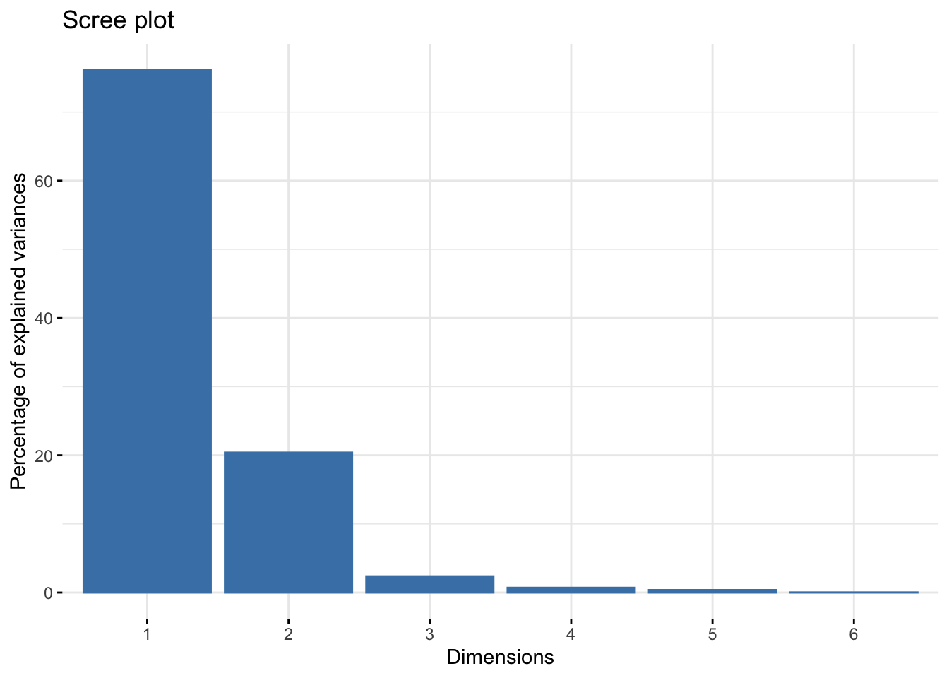
Following the book’s example in 9.4.2, we can explicitly calculate a residual matrix, which shows the difference between expected (assuming random distribution) and observed values for given row/column intercepts, in the following steps. This doesn’t feed into visualizations, but it may be helpful to have a quantitative reference for residuals:
rowsums_colors <- as.matrix(apply(color_matrix, 1, sum))
colsums_colors <- as.matrix(apply(color_matrix, 2, sum))
expected_colors <- rowsums_colors %*% t(colsums_colors) / sum(colsums_colors) # using matrix multiplication to see what
# "average" values should look like if row and column sums are distributed evenly across the dataset

#sum((color_matrix - expected_colors)^2 / expected_colors)

# subtracting the "expected" matrix from the observed  values to see discrepancies

(residual_table_colors <- color_matrix - expected_colors %>%

    t() %>%

    round())
## black white green blue orange purple grey
## happy 2604538 7252731 6644019 7090159 3616948 2332753 1890798
## angry -6856953 -19511 -241131 891748 657779 448415 620320
## quiet -6291637 848427 1103422 1745469 859372 639948 797493
## lively -6766161 610622 693006 868322 -1000836 381433 587529
## clever -2852964 868979 700121 -965911 -261613 317732 427122
## depressed -1374026 750108 -1383422 -359058 -550269 8671 111484
## virtuous -2513797 -3678280 -1290876 -1133364 -811323 -31532 -2510
## perplexed -3113357 -2153156 -1204300 -1081265 -414128 -15750 -2339Here, we can see that, for instance, the combination of “happy” and “black” in searches occurs significantly more often (~26,000,000 additional instances) than we’d expect given no correlations between colors and sentiments, while e.g. “happy” and “grey” is much rarer.
To take these patterns more intuitively, we can use a mosaic plot to visualize the proportional distribution of color/sentiment terms in searches (e.g. “back” and “happy” are both popular terms, so could be expected to occur more frequently than e.g. “perplexed” and “purple” in any case), as well as color coding for residuals:
mosaicplot(t(color_matrix / 2000), las = 2, shade = TRUE, type = 'pearson') # dividing values by 2,000 because the mosaic plot function doesn't seem to auto-scale colors, meaning that the unaltered matrix is all "flattened" to the <4 or >4 category.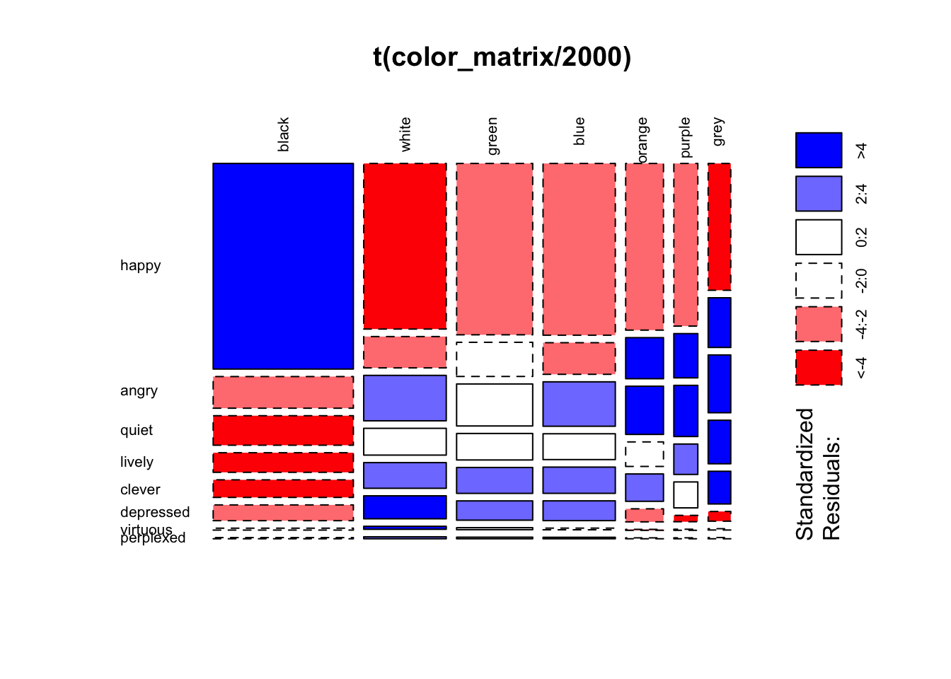
#transposing is just aesthetic; seems easier to follow with sentiments on the y axis as far as labels and visual row/column continuity. From this pattern, it’s easier to see broad patterns and associations among colors and sentiments. For instance, if we focus on colors, we can see black is quite distinct from most colors, with more than expected with happy and lower for other sentiments. All other sentiments behave more like each other than black, but do show a smaller division between white, blue, and green; this is distinguished from orange, purple, and grey by being rarer than expected (under random distribution) with angry and more common with depressed, virtuous, and perplexed. Based on this, in a 2D projection we might expect to see the largest separation between black and all other colors, with a smaller but obvious distinction between the two other color clusters. Because quiet, lively, and clever are more common than expected for everything but black, the will likely be about equidistant between these clusters.
To check how close we got with these eyeballed estimates, we can use the factoextra biplot visualization function fviz_ca_biplot for correspondence analysis to see our biplot for sentiment and color searches. I thought using the option to represent one as vector arrow, rather than points, also improves legibility (e.g. the relationship between angry and orange/purple become more obvious):
fviz_ca_biplot(color_matrix_ca, arrows = c(FALSE, TRUE), repel = TRUE)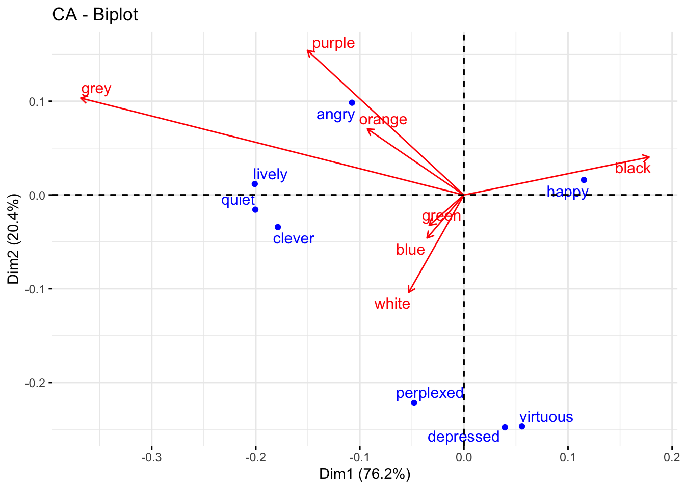
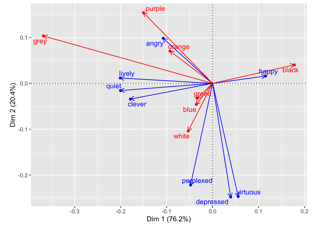
As we can see, sentiment and color groups show similar relationships from what we might expect comparing patterns of positive/negative residuals in the mosaic plot. However, this makes it easier to see some patterns, such as the strong opposition between black and grey on dimension 1, or the fact that most of dimension 2 is due to the differences of green-white-blue and perplexed-depressed-virtuous from the rest of the data. We can also make out some smaller trends that weren’t obvious (at least to me) from the mosaic visualization, like grey being more distinct from orange and purple than we could make out with the mosaic plot’s effective “resolution”. This separation appears to be driven by higher co-occurrence with lively, quiet, and clever. Looking back to our mosaic plot, the latter three have lighter shades of blue in orange and purple, with no obvious difference with angry.
Plotting directly with ggplot:
While factoextra uses custom functions to streamline the process, it’s possible to approximate the same visualization using ggplot and components of the dudi object. In the color_matrix_ca object, the ‘row’ and ‘column’ factor coordinates (emotion and color, respectively) are stored at .$li and .$co, This allows direct plotting; you could also look at e.g. normalized scores in .$l1 and .$c1 as well. I was able to get a general sense of how the factoextra authors approached this using the call View(fviz_ca_biplot) to pull up the function’s R code; this ultimately pointed to the more fundamental fviz function.
Using this information, we can render single plots for color:
#Single plots: (roughly equivalent to default output for `fviz_ca_col` and `fviz_ca_row`)

color_nmds <- color_matrix_ca$co %>%
  ggplot() +
  aes(x = Comp1, y = Comp2) +
  geom_point(color = 'blue') +
  geom_text(label = rownames(color_matrix_ca$co), nudge_y = 0.01, color = 'blue') +
  coord_fixed()

color_nmds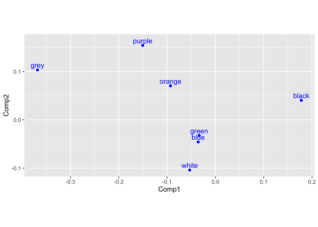
and sentiment (below). We can also use the geom_segment function in ggplot to replicate the arrows seen in the factoExtra biplot:
emotion_nmds <- color_matrix_ca$li %>%
  ggplot() +
  aes(x = Axis1, y = Axis2) +
  geom_point(color = 'red') +
  ggrepel::geom_text_repel(label = rownames(color_matrix_ca$li), nudge_y = 0.01, color = 'red') +
  geom_segment(aes(x = 0, y = 0, xend = Axis1, yend = Axis2),

               arrow = arrow(length = unit(0.3,"cm")),

               color = "red") +
  coord_fixed()


emotion_nmds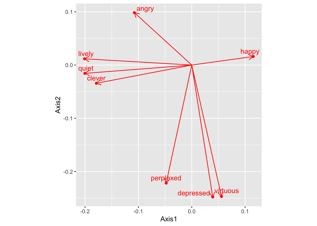
We can combine these elements into a biplot by combining the above dataframes, with one column for each value, and plotting the result:
# Biplot (there are probably more efficient/correct approaches)

#manually joining the two datasets using a common index (generates a partial row of NAs, with 8 sentiments and 7 colors)

color_component <- color_matrix_ca$co %>%
  rownames_to_column(var = "color") %>%
  rownames_to_column(var = "index")

emotion_component <- color_matrix_ca$li %>%
  rownames_to_column(var = "emotion") %>%
  rownames_to_column(var = "index")

biplot_composite <- color_component %>%
  full_join(emotion_component, by = "index")

(biplot_composite)
## index color Comp1 Comp2 emotion Axis1 Axis2
## 1 1 black 0.17794592 0.04039331 happy 0.11532145 0.01602901
## 2 2 white -0.05317953 -0.10399481 angry -0.10756934 0.09837664
## 3 3 green -0.03347037 -0.03237667 quiet -0.20048082 -0.01564279
## 4 4 blue -0.03552655 -0.04588027 lively -0.20105512 0.01174266
## 5 5 orange -0.09284092 0.07047109 clever -0.17886743 -0.03423825
## 6 6 purple -0.15049601 0.15422498 depressed 0.03935532 -0.24782949
## 7 7 grey -0.36826914 0.10335528 virtuous 0.05572888 -0.24684976
## 8 8 <NA> NA NA perplexed -0.04792928 -0.22173448biplot_composite_plot <- biplot_composite %>%
ggplot() +
aes(x = Comp1, y = Comp2) +
geom_point(color = 'red') +
geom_text(label = biplot_composite$color, nudge_y = 0.01, color = 'red') +
geom_segment(aes(x = 0, y = 0, xend = Comp1, yend = Comp2),
arrow = arrow(length = unit(0.3,"cm")),
color = "red") +
geom_point(aes(x = Axis1, y = Axis2), color = 'blue') +
geom_text_repel(aes(x = Axis1, y = Axis2), label = biplot_composite$emotion, nudge_y = 0.01, color = 'blue') +
geom_hline(yintercept = 0, lty = 2) +
geom_vline(xintercept = 0, lty = 2) +
labs(x = paste0("Dim1(",round(color_matrix_ca$eig[1]/sum(color_matrix_ca$eig)*100, 1),"%)"),
y = paste0("Dim2(",round(color_matrix_ca$eig[2]/sum(color_matrix_ca$eig)*100, 1),"%)") +
coord_fixed()
)
biplot_composite_plot## Warning: Removed 1 rows containing missing values (geom_point).## Warning: Removed 1 rows containing missing values (geom_text).## Warning: Removed 1 rows containing missing values (geom_segment).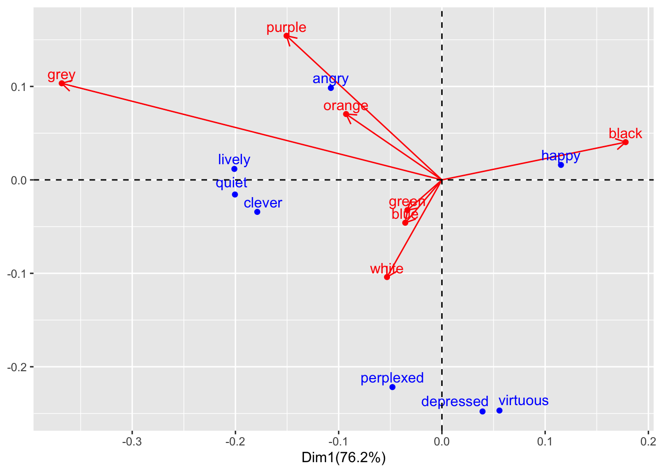
Second Approach
Dr. Anderson also worked out a more-efficient approach making use of purrr package function, unclass, map_at and other tools to unite the two coa / dudi objects with fewer intermediate steps:
color_matrix_ca %>%
  # `unclass` to work with this as a regular list
  unclass() %>%
  # `keep` lets you keep just some elements of a list. We'll keep "co" and "li" elements
  keep(names(.) %in% c("co", "li")) %>%
  # both of these have important info in their rownames, so move those into a column.
  # `map` allows you to do the same thing to every element of the list (now just "co" and "li"
  map(rownames_to_column) %>%
  # `map_at` lets you do something to *just* some elements of a list. So here, to be able
  # to bind the two dataframe elements in the list into one dataframe, you need to
  # make sure they have the same column names. Currently, they don't, so we need to
  # change the column names for one of them.
  map_at("co", ~ rename(.x, Axis1 = Comp1, Axis2 = Comp2)) %>%
  # Now that we have a list where each element is a dataframe with the same number
  # of columns, and where those columns have the same names and data types, you
  # can use `bind_rows` to stick them together into one dataframe (it turns out that
  # this is a *super* helpful function). After this step, you have a tidy dataframe. The
  # `.id` parameter is adding a column with the original list element name, so you can
  # tell which rows originally came from "co" and which from "li"
  bind_rows(.id = "id") %>%
  ggplot(aes(x = Axis1, y = Axis2, color = id)) +
  geom_point() +
  # You can add arrows to your segments with the `arrow` function (from the
  # `grid` package, which is very old school graphics and what ggplot is built on)
  # To have everything come from the center, you set the starting point to 0 for
  # both x- and y-axes
  geom_segment(aes(x = 0, y = 0, xend = Axis1, yend = Axis2),
               arrow = arrow(length = unit(0.1, "inches"))) +
  geom_text_repel(aes(label = rowname)) +
  # `coord_fixed` ensures that the x- and y-axes are scaled so they have the
  # same unit size
  coord_fixed() +
  # `str_c` lets you stick character strings together (`paste0` would also work here)
  labs(x = str_c("Dim 1 (",
                 round(100 * color_matrix_ca$eig[1] / sum(color_matrix_ca$eig), 1),
                 "%)"),
       y = str_c("Dim 2 (",
                 round(100 * color_matrix_ca$eig[2] / sum(color_matrix_ca$eig), 1),
                 "%)")) +
  scale_color_manual(values = c("red", "blue")) +
  # Get rid of the color legend
  theme(legend.position = "none") +
  # Add some reference lines for 0 on the x- and y-axes
  geom_hline(aes(yintercept = 0), linetype = 3) +
  geom_vline(aes(xintercept = 0), linetype = 3)