Exercise solution for Chapter 7
Exercise 7.4 from Modern Statistics for Modern Biology
Let’s revisit the Hiiragi data and compare the weighted and unweighted approaches. 7.4a Make a correlation circle for the unweighted Hiiragi data
xwt. Which genes have the best projections on the first principal plane (best approximation)? 7.4b Make a biplot showing the labels of the extreme gene-variables that explain most of the variance in the first plane. Add the the sample-points.
Read in and clean data
We start by loading the libraries:
library("Hiiragi2013")
library("ade4")
library("factoextra")
library("pander")
library("knitr")
library("tidyverse")
library("ggrepel")
You can install the libraries using install.packages for the ade4 and factoextra packages and such, and the following line for Hiiragi2013:
BiocManager::install("Hiiragi2013")We will analyze data from the Hiiragi2013 package containing a gene expression microarray dataset describing the transcriptomes of about 100 cells from mouse embryos at different times during early development.
I copied the code from the textbook to clean the data. A tidyverse version of this code is available on Brooke Andersons’s github. In either case, we select the wildtype (WT) samples. Then we select the 100 features with the largest variance.
data("x", package = "Hiiragi2013")
xwt <- x[, x$genotype == "WT"]
sel <- order(rowVars(Biobase::exprs(xwt)), decreasing = TRUE)[1:100]
xwt <- xwt[sel, ]
The resulting data is of the ExpressionSet class, a class designed to combine many types of data such as microarray data, metadata, and protocol information. The data is shown below. I transposed the data so the rows correspond to samples and the first 101 columns correspond to different genes. I only showed the first the columns and then skipped to the end for brevity. The last columns give additional data about each sample, such as the total number of cells and the scan date.
kable(head(as.data.frame(xwt)[,c(1:3,102:108)]))| X1434584_a_at | X1437325_x_at | X1420085_at | Embryonic.day | Total.number.of.cells | lineage | genotype | ScanDate | sampleGroup | sampleColour | |
|---|---|---|---|---|---|---|---|---|---|---|
| 1 E3.25 | 13.24888 | 2.332223 | 3.027715 | E3.25 | 32 | WT | 2011-03-16 | E3.25 | #CAB2D6 | |
| 2 E3.25 | 11.98757 | 2.475742 | 9.293017 | E3.25 | 32 | WT | 2011-03-16 | E3.25 | #CAB2D6 | |
| 3 E3.25 | 12.72695 | 1.955642 | 2.940142 | E3.25 | 32 | WT | 2011-03-16 | E3.25 | #CAB2D6 | |
| 4 E3.25 | 12.51926 | 2.061255 | 9.715243 | E3.25 | 32 | WT | 2011-03-16 | E3.25 | #CAB2D6 | |
| 5 E3.25 | 12.01299 | 2.308667 | 8.924228 | E3.25 | 32 | WT | 2011-03-16 | E3.25 | #CAB2D6 | |
| 6 E3.25 | 10.50750 | 2.202948 | 11.325952 | E3.25 | 32 | WT | 2011-03-16 | E3.25 | #CAB2D6 |
a) Make a correlation circle
Next we plot a correlation circle. This allows us to plot the original genes projected onto the first two principal axes. We can interpret the angles between the vectors as a measure of the correlation between the two corresponding genes. The length of the arrows indicates the correlation of a gene with the first principal axes. This allows us to visualize the correlation between genes, as well as see which genes are best described by our first two principal components. The first principal component is the linear combination of the genes with maximum variance. The second principal component is the linear combination of the genes with maximum variance while being orthogonal to the first principal component.
First I used dudi.pca to perform principal component analysis and get a pca and dudi class object. In the text book, they performed a weighted PCA because the groups had very different sample sizes ranging from 4 to 36. A weighted analysis would give the groups equal weight, while an unweighted would give each observation equal weight (and thus give less weight to groups with less members). We are interested in the difference in the genes at the various developmental phases, so in general it would make sense to do a weighted analysis in order to let each developmental phase group have an equal say. To compare the weighted with an unweighted PCA I didn’t use the row.w option as the textbook did in order to fit an unweighted PCA.
In the following code t takes the transpose so the rows correspond to samples. The exprs function is used to access the expression and error measurements of the data. I chose to center and scale the data, meaning make each column have a mean of 0 and a variance of 1. The scannf option prevents the function from plotting a scree plot and nf tells it to keep two axes (i.e. 2 principal components).
pcaMouse <- dudi.pca(as.data.frame(t(Biobase::exprs(xwt))),
                            center = TRUE, scale = TRUE, nf = 2, scannf = FALSE)
Then I used the fviz_pca_var function to plot the correlation circle. I used geom= "arrow" to remove the labels of each arrow as they were all overlapping. The default for this argument is to print both arrows and text labels for each line.
fviz_pca_var(pcaMouse, col.circle = "black",geom= "arrow") + ggtitle("") 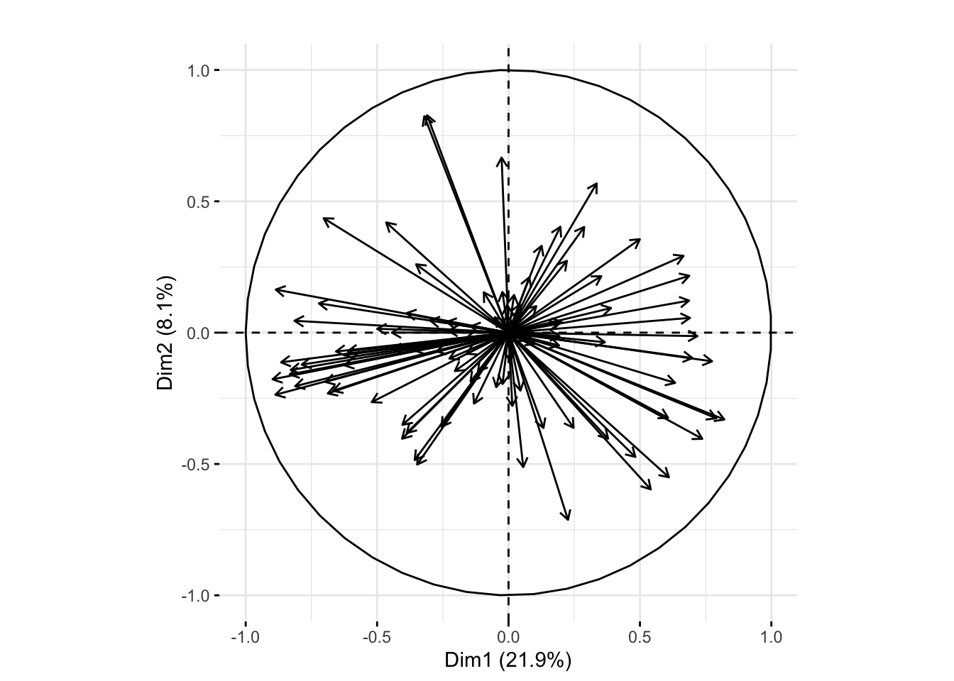
We can compare that plot to the one below showing the correlation circle from a weighted analysis. We can see in the weighted analysis the first principal plane does a better job of explaining the variation as indicated by the percent of variation explained by each dimension as well as the length of the arrows.
tab = table(xwt$sampleGroup)
xwt$weight = 1 / as.numeric(tab[xwt$sampleGroup])
pcaMouseWeighted <- dudi.pca(as.data.frame(t(Biobase::exprs(xwt))),
                    row.w = xwt$weight,
                    center = TRUE, scale = TRUE, nf = 2, scannf = FALSE)
fviz_pca_var(pcaMouseWeighted, col.circle = "black",geom= "arrow") + ggtitle("") 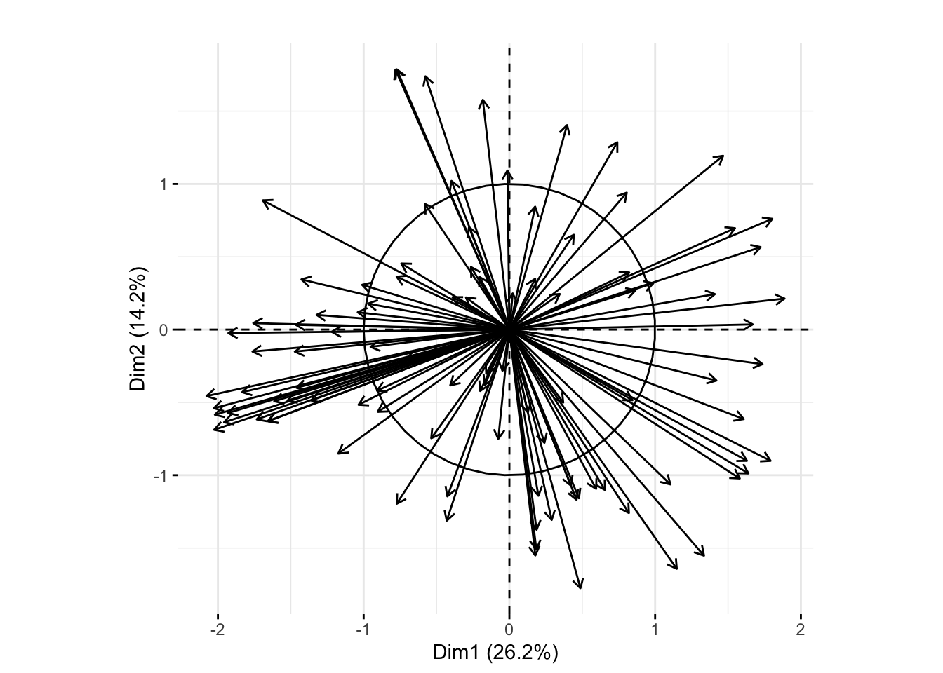
The genes that have the best projections on the first principal plane (meaning those with the strongest correlation with the principal axes) are those with the longest arrows on the plots above. I extracted the genes with arrow lengths greater than 0.8 from the unweighted PCA plot with the following code:
corrCircle <- fviz_pca_var(pcaMouse, col.circle = "black")$data
arrowLengths <- sqrt(corrCircle$x^2+corrCircle$y^2)
cutoff <- 0.8
kpInd <- order(arrowLengths, decreasing=TRUE)[1:sum(arrowLengths>cutoff)]
genes <- corrCircle[kpInd,"name"]genes1456270_s_at, 1450624_at, 1449134_s_at, 1418153_at, 1420085_at, 1420086_x_at, 1434584_a_at, 1450843_a_at, 1429483_at, 1437308_s_at, 1456598_at, 1460605_at, 1429388_at, 1426990_at, 1436392_s_at and 1452270_s_at
To summarize, the code above saves output from the fviz_pca_var function to an object called corrCircle. I used the output (which included x and y coordinates) to calculate the arrow length for each gene. I then created a vector, kpInd, with the indice number for genes that had a length greater then the cutoff of 0.8. Finally, I output the names of those genes with length great than 0.8. Below is a plot showing just these genes with the ``best projection," meaning they are most correlated with the plane of maximum variation.
corrCircle %>%
  mutate(length = sqrt(x^2 + y^2)) %>%
  filter(length >= 0.8) %>%
  ggplot(aes(x = 0, xend = x, y = 0, yend = y)) +
  geom_segment(arrow = arrow(length = unit(0.1, "inches"))) +
  geom_label_repel(aes(x = x, y = y, label = name),
                   size = 2, alpha = 0.7) +
  coord_fixed()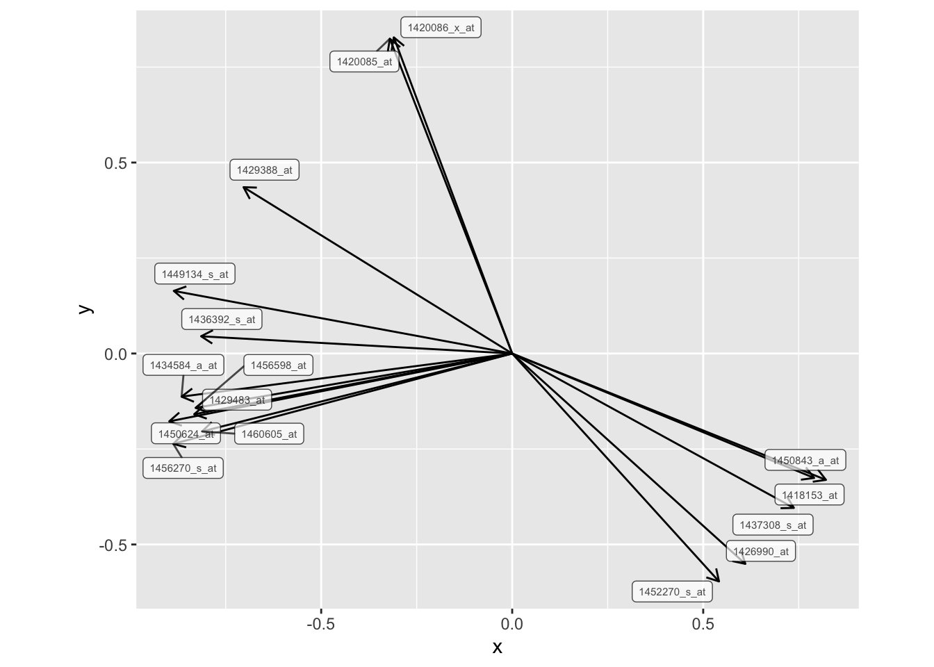
b) Make a biplot
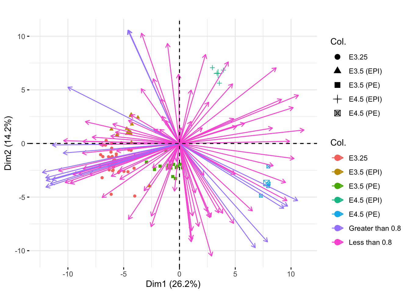
Next we make a biplot to visualize samples and the genes in one plot. I used the fviz_pca_biplot function. The col.var and col.ind options allow you to color the different genes and sample points, respectively, by particular groups. I used label="" to remove the labels on the vectors and points. The above8 variable is simply a vector of either “Less than 0.8” or “Greater than 0.8” to indicate if each gene’s vector length was less than or greater than our cutoff value on the correlation circle.
above8 <- rep("Less than 0.8", dim(xwt)[1])
above8[1:100 %in% kpInd] <- "Greater than 0.8"
fviz_pca_biplot(pcaMouse, col.var=above8, col.ind=xwt$sampleGroup, label="") +
ggtitle("") 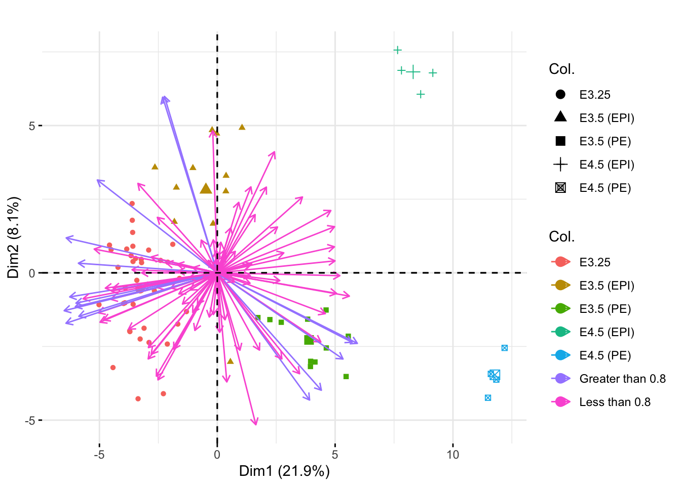
The colors/shapes of the point indicate the sample group of each sample point. The colors of the arrows indicate whether or not the corresponding gene had length greater than or less than 0.8 on the correlation circle.
We can see the EPI and PE groups (the groups with the fewest samples) appear more extreme in the first principle plane when using the unweighted PCA. This was not the case in the weighted PCA (shown below) because then groups were weighted equally. Here, the PCA mostly depends on the larger groups (to best understand the most observations), so the smaller groups appear more extreme on the principal plane.
above8 <- rep("Less than 0.8", dim(xwt)[1])
above8[1:100 %in% kpInd] <- "Greater than 0.8"
fviz_pca_biplot(pcaMouseWeighted, col.var=above8, col.ind=xwt$sampleGroup, label="") +
ggtitle("") 