Exercise Solution for Chapter 12
Exercise 12.2 from Modern Statistics for Modern Biologists
Use
glmnetfor a prediction of a continous variable, i.e., for regression. Use the prostate cancer data from Chapter 3 of (Hastie, Tibshirani, and Friedman 2008). The data are available in the CRAN packageElemStatLearn. Explore the effects of using Ridge versus Lasso penalty.
Here are the packages that need to be installed.
library(dplyr)
library(ggplot2)
library(glmnet) # perform generalize linear models
library(GGally) # used for ggpairs function
library(superheat) # used to show correlation between variables
Data for the exercise
The ElemStatPackage isn’t on CRAN anymore. But it is possible to download it from Github at: https://github.com/cran/ElemStatLearn/blob/master/data/prostate.RData
load("./example_datasets/prostate.RData")

prostate %>%
  head()
## lcavol lweight age lbph svi lcp gleason pgg45 lpsa
## 1 -0.5798185 2.769459 50 -1.386294 0 -1.386294 6 0 -0.4307829
## 2 -0.9942523 3.319626 58 -1.386294 0 -1.386294 6 0 -0.1625189
## 3 -0.5108256 2.691243 74 -1.386294 0 -1.386294 7 20 -0.1625189
## 4 -1.2039728 3.282789 58 -1.386294 0 -1.386294 6 0 -0.1625189
## 5 0.7514161 3.432373 62 -1.386294 0 -1.386294 6 0 0.3715636
## 6 -1.0498221 3.228826 50 -1.386294 0 -1.386294 6 0 0.7654678
## train
## 1 TRUE
## 2 TRUE
## 3 TRUE
## 4 TRUE
## 5 TRUE
## 6 TRUEThis data looks at correlating the level of prostate-specific antigen lpsa and eight other clinical measures in men.
Here’s what the variables mean:
lcavol: log cancer volumelweight: log prostate weightage: in yearslbph: log of the amount of benign prostatic hyperplasiasvi: seminal vesicle invasionlcp: log of capsular penetrationgleason: a numeric vector with the Gleason scorepgg45: percent of Gleason score 4 or 5lpsa: response (the thing you are trying to predict), the level of prostate-specific antigentrain: a logical vector, of whether the data was to be part of the training dataset (TRUE) or the testing one (FALSE)
So, you’re trying to predict the values of lpsa based on all of the other variables. lpsa is a continuous variable. To get a general view of the lpsa values, we can view a summary of values and create a histogram.
prostate$lpsa %>%
  summary()
## Min. 1st Qu. Median Mean 3rd Qu. Max.
## -0.4308 1.7317 2.5915 2.4784 3.0564 5.5829ggplot(prostate, aes(x = lpsa)) +
geom_histogram(bins = 30) +
ggtitle("Histogram of lpsa response")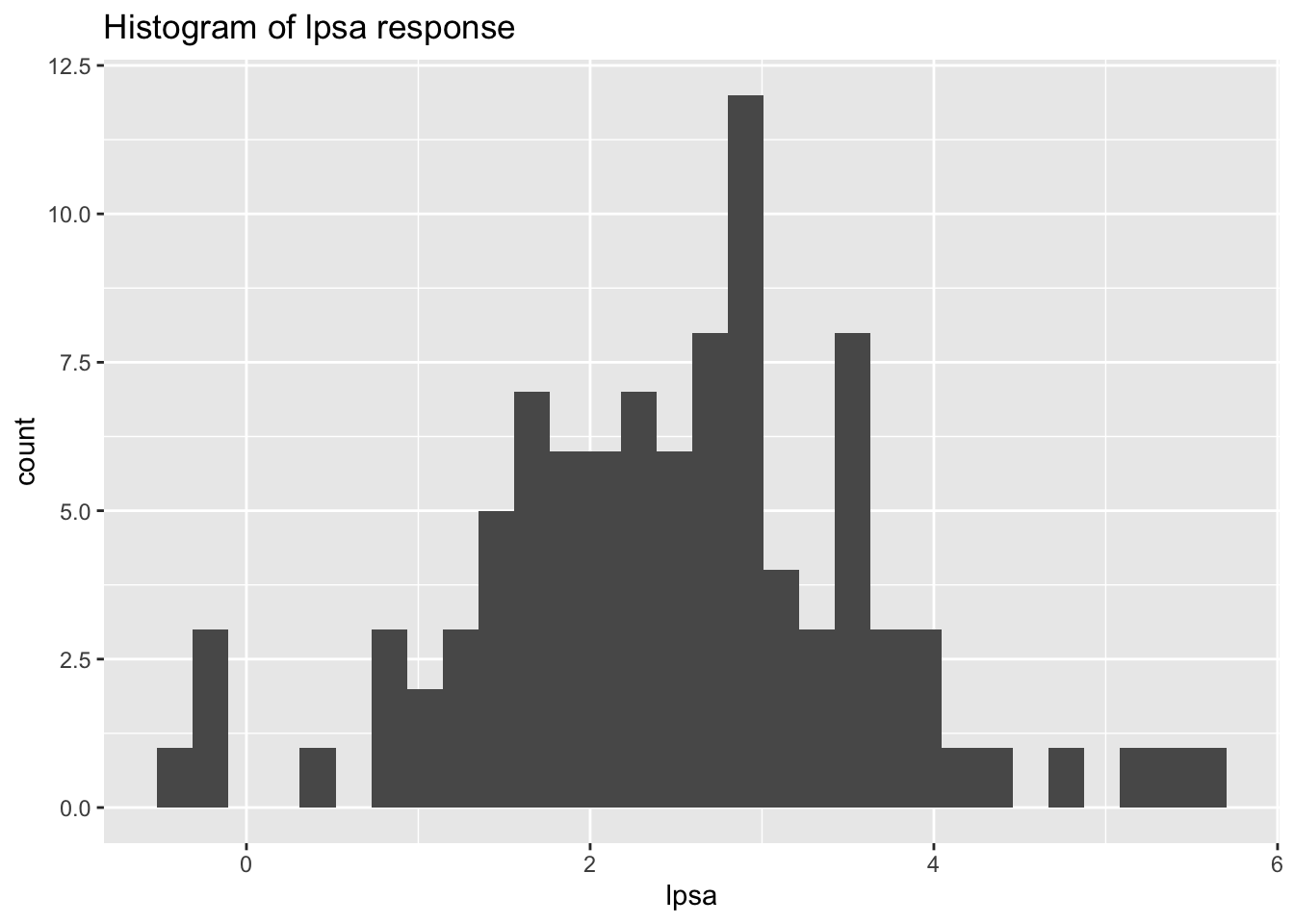
Here we can see the values range from -0.4 to values of almost 6. Based on the histogram, the data seems to also fit a close to normal distribution.
Before actually performing any predictions, we may want to see if any of the variables are correlated to each other. This can show if there are potentially two variables measuring similar things. We use the ggpairs function from the GGally package to do this.
ggpairs(prostate)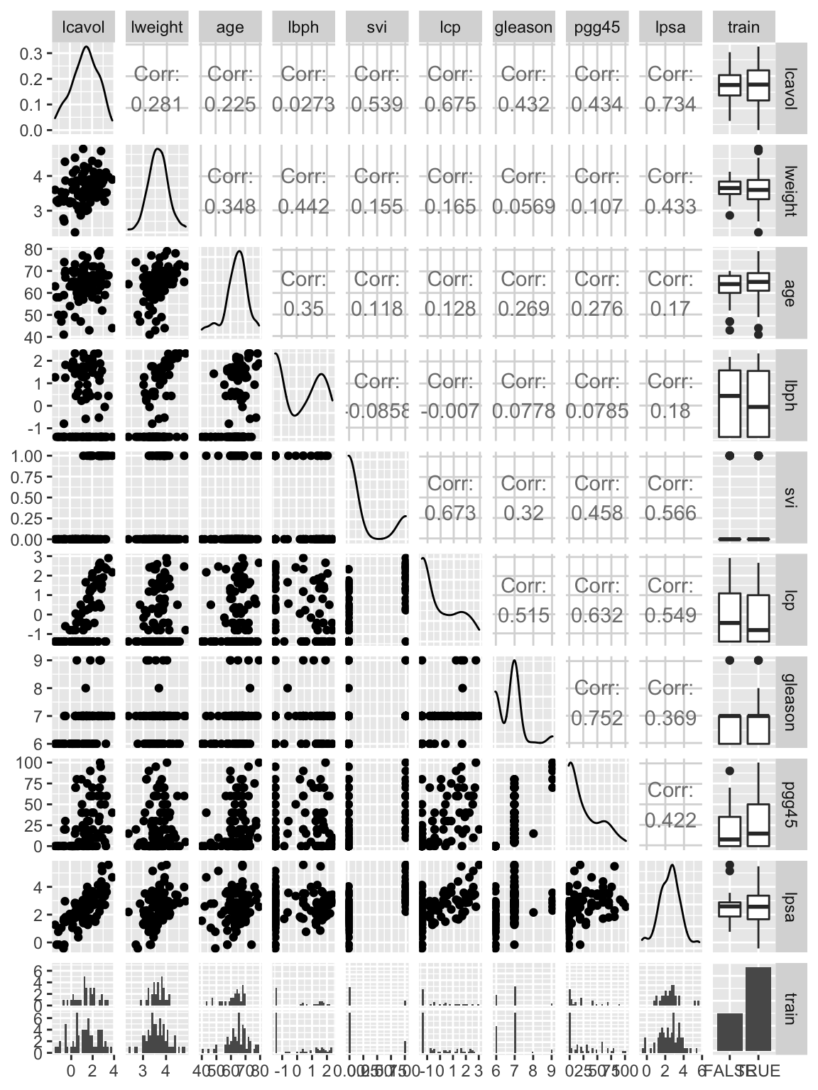
Based on this plot, we can see that some variables, such aspgg45 and gleason, are highly correlated. We can also see the distribution of the data in the testing and training datasets (we will discuss the testing and training column later in this exercise).
We can also visually view correlations between the variables using the cor function and a heatmap from thesuperheat package.
prostate %>%
  select(-train) %>%
  cor() %>%
  superheat()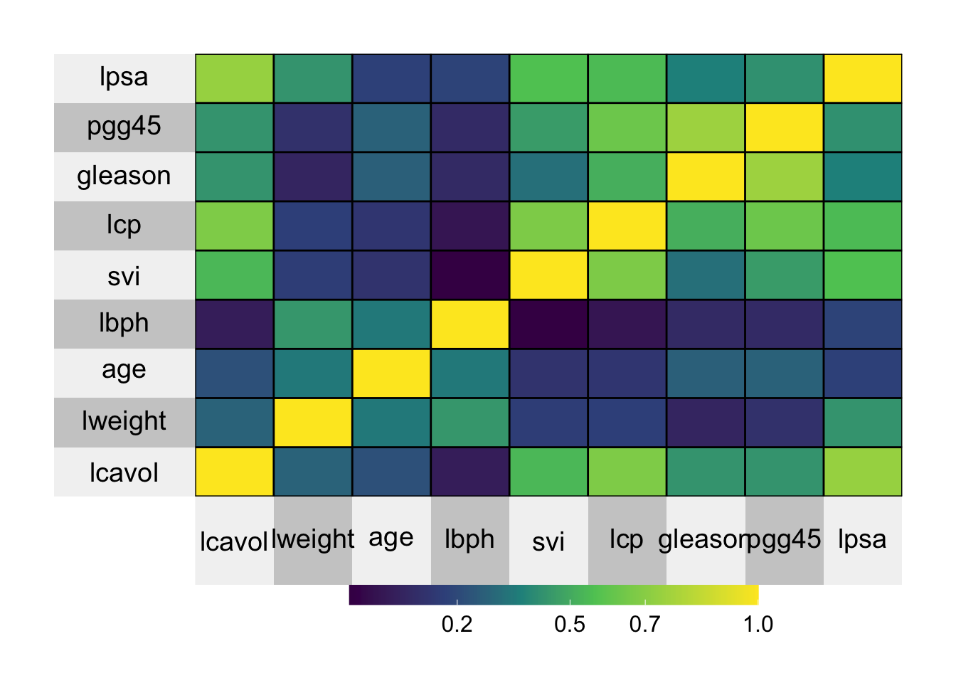
This plot shows the same data as the ggpairs output, but we can visually see the correlation between each of the variables. If the correlation is high and positive, then the rectange is yellow, if the correlation between two variables is low, the rectangle is purple.
We will first split the data into testing and training data.
prostate_train <- prostate %>%
  filter(train == TRUE)

prostate_test <- prostate %>%
  filter(train == FALSE)
There are 67 samples in the training set and 30 samples in the testing set.
Because this data was specifically posted to teach machine learning, the authors included a column called train so that users can split the data into testing and training datasets. If this column had not been created, there are many ways to sample the data and split it into two datasets. Here is an example:
install.packages("rsample")
library(rsample)
prostate_split <- initial_split(prostate, prop = .75)
prostate_test <- testing(prostate_split)
prostate_train <- training(prostate_split)
Fit generalized linear model (glmnet) with Lasso and Ridge penalties
We will first pull out the predictors and reponse that we want to input into the glmnet function.
# pull outall of the predictors that we are using
predictors <- prostate_train %>%
  select(lcavol:pgg45) %>%
  as.matrix()

head(predictors)
## lcavol lweight age lbph svi lcp gleason pgg45
## [1,] -0.5798185 2.769459 50 -1.386294 0 -1.386294 6 0
## [2,] -0.9942523 3.319626 58 -1.386294 0 -1.386294 6 0
## [3,] -0.5108256 2.691243 74 -1.386294 0 -1.386294 7 20
## [4,] -1.2039728 3.282789 58 -1.386294 0 -1.386294 6 0
## [5,] 0.7514161 3.432373 62 -1.386294 0 -1.386294 6 0
## [6,] -1.0498221 3.228826 50 -1.386294 0 -1.386294 6 0# this is the response
response <- prostate_train %>%
pull(lpsa)When performing statistical analysis on data with many variables, we often have a problem with variance as there are many parameters. We can use penalization to account for this variance-bias trade off. Two examples of penalization are the Lasso and Ridge penalty which we will use in this exercise.
Based on the glmnet package, when alpha = 1 the Lasso penalty is used, if alpha = 0, then Ridge penalty is used. A great resource for the glmnet package can be found here: https://web.stanford.edu/~hastie/glmnet/glmnet_alpha.html
Here, we use a matrix of all of the predictors (x) to try to predict the lpsa column (y). When we plot the penalized regressions, we use the label = TRUE to show which lines correspond to which predictors. In this case, the order of the input vector predictors matches with the variable numbers as follows.
1: lcavol
2: lweight
3: age
4: lbph
5: svi
6: lcp
7: gleason
8: pgg45
# Lasso
lasso_glmnet <- glmnet(x = predictors,
                    y = response,
                    family = "gaussian", alpha = 1)

plot(lasso_glmnet, label = TRUE)
title("Lasso Penalty", line = -2.5)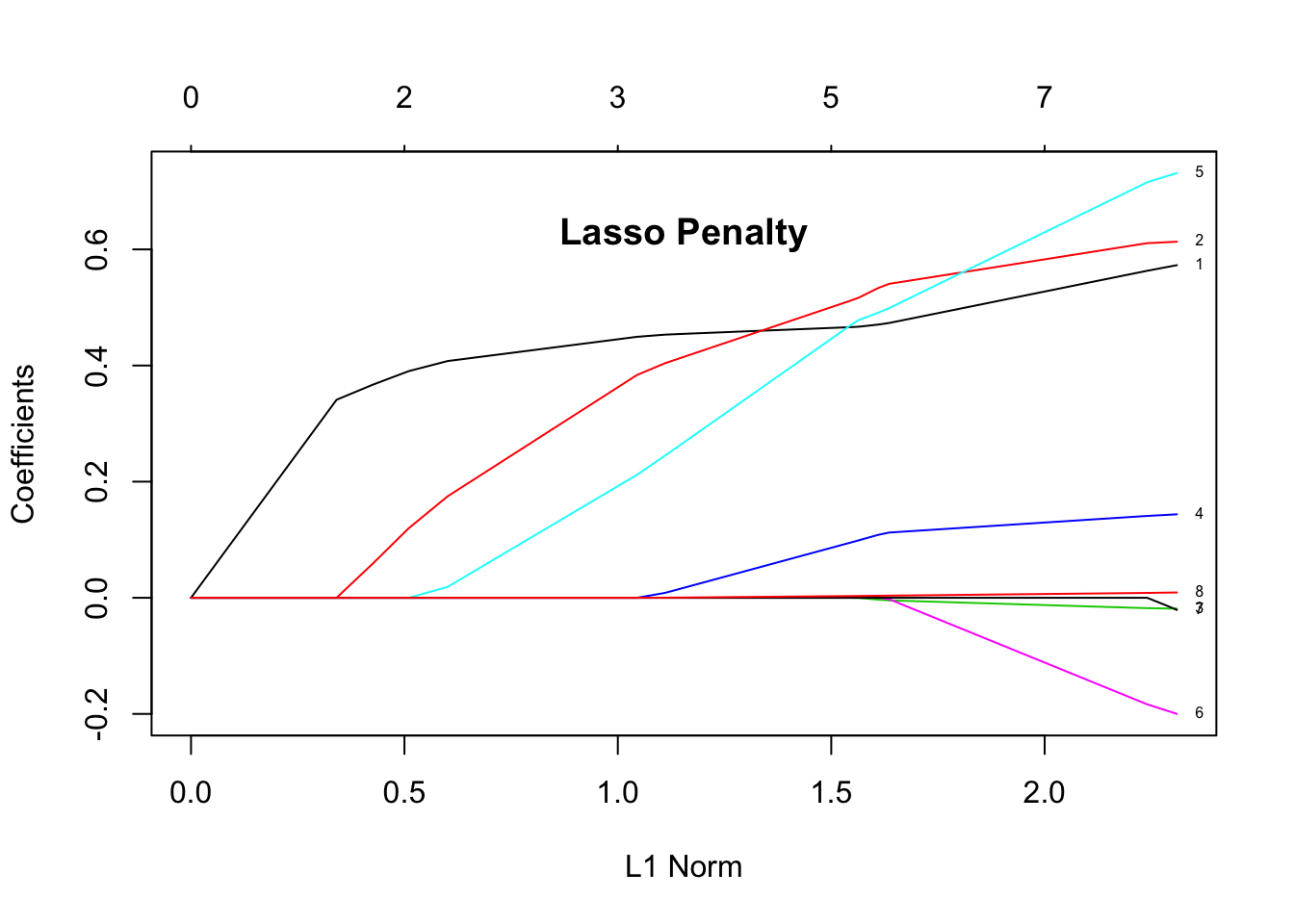
# Ridge
ridge_glmnet <- glmnet(x = predictors,
                    y = response,
                    family = "gaussian", alpha = 0)

plot(ridge_glmnet, label = TRUE)
title("Ridge Penalty", line = -1.5)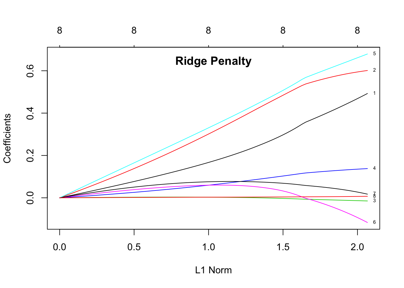
The plots show the estimated coefficients as L1 norm increases. L1 norm is the regularization term. It means that at small L1 norm values, there is a lot of regularization, but as it increases, more variables become part of the model as coefficients take non-zero values. The top axis shows the number of nonzero coefficients correspoding to the lamba at the current L1 norm. From these plots we can see that the variables 1 (log cancer volume), 2 (log prostate weight), and 5 (seminal vesicle invasion) are good predictors for the level of prostate-specific antigen (lpsa response).
Cross Validation
After creating our models, we want to see how good they are. We can do this through cross-validation. In this case, we already split the data into training and testing data, but we could run the full modeling and cross-validation on all of the data. We use the cv.glmnet function to do this. It utilizes k-fold cross validation, meaning that the input data is split multiple times into new trainng and testing sets of sizes n(k-1)/k and n/k, respectively. We use this cross-validation to determine the best \(\lambda\). Again we input a matrix of all of the predictors (x) to look at the lpsa response (y).
set.seed(2)

# Lasso
cvglmnet_lasso <- cv.glmnet(x = predictors,
                    y = response,
                    family = "gaussian", alpha = 0)
cvglmnet_lasso
##
## Call: cv.glmnet(x = predictors, y = response, family = "gaussian", alpha = 0)
##
## Measure: Mean-Squared Error
##
## Lambda Measure SE Nonzero
## min 0.0879 0.5939 0.09857 8
## 1se 0.9873 0.6873 0.08098 8plot(cvglmnet_lasso)
title("Lasso Cross Validation", line = -1.5)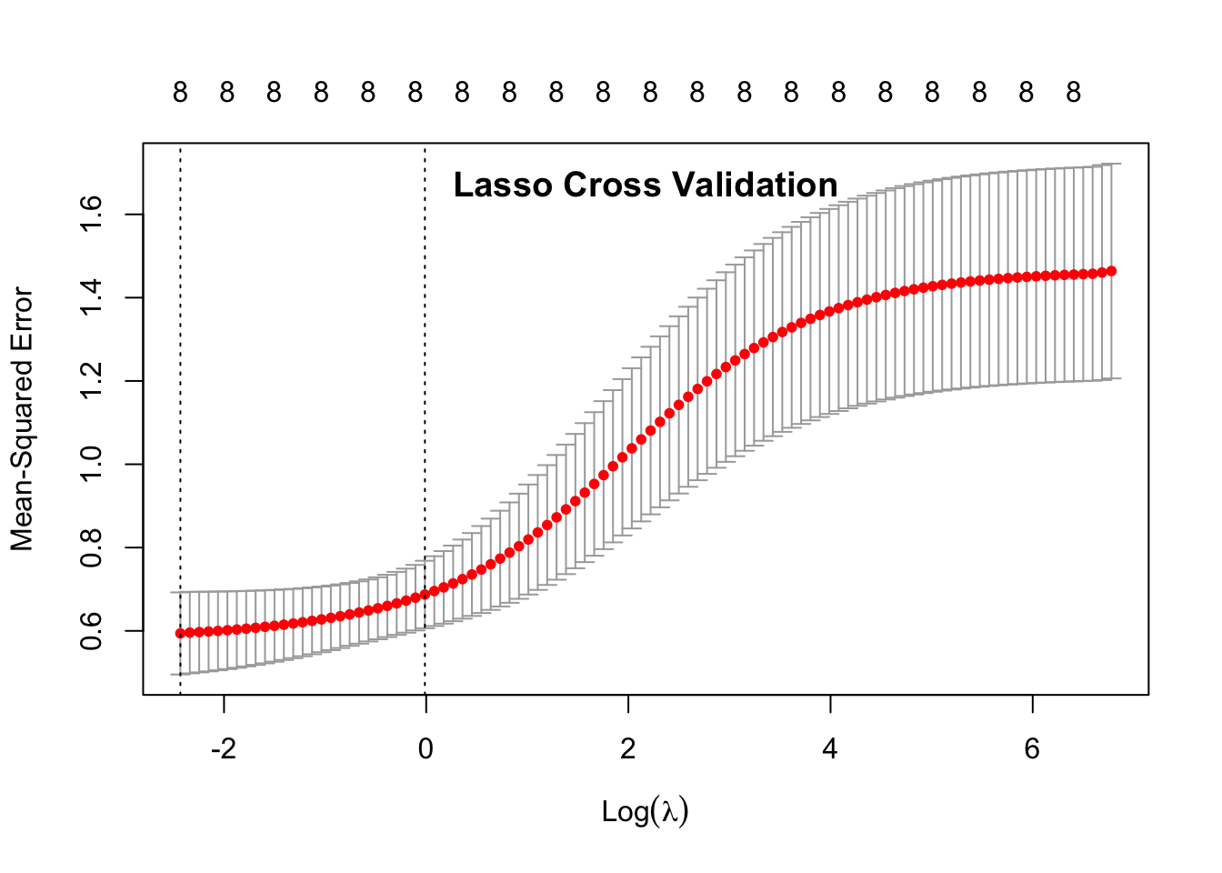
# Ridge
cvglmnet_ridge <- cv.glmnet(x = predictors,
                    y = response,
                    family = "gaussian", alpha = 1)
cvglmnet_ridge
##
## Call: cv.glmnet(x = predictors, y = response, family = "gaussian", alpha = 1)
##
## Measure: Mean-Squared Error
##
## Lambda Measure SE Nonzero
## min 0.01336 0.5753 0.07244 7
## 1se 0.13673 0.6408 0.09222 5plot(cvglmnet_ridge)
title("Ridge Cross Validation", line = -1.5)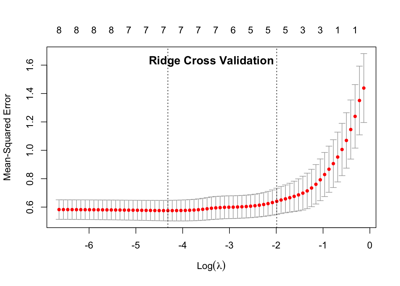
In the data output, 1se is the data point that is within 1 standard error of the minimum \(\lambda\) (min). This is the value that the model suggests that we use in our ultiamate predictive model (indicated by the 2nd dotted line on the plots.)
The 1se Measure is similar to the mean squared error. If the measure is small, then the model is better. When comparing the Measure of the 1se between the two penalties, we can see that the Ridge Penalty has a smaller 1se Measure, showing that it performs better.
The Nonzero column describes the nonzero coefficients, or the number of predictors that are important in the particular model. There were a total of 8 predictors as the input. The Lasso penalty shows that all 8 predictors are important in building the model, but the Ridge penalty only uses 5 predictors.
Based on this cross-validation, we can deduce that the Ridge penalty is the best predictive model to use for this data. We have also identified the best \(\lambda\) to use with this model at 0.18074.
Lasso Prediction
Here we pull out the same variables that we used to create the model, but we use the values from the testing data instead of the training data. We will then use the predictors from the testing data to predict the lpsa.
predictors_test <- prostate_test %>%
  dplyr::select(lcavol:pgg45) %>%
  as.matrix()

head(predictors_test)
## lcavol lweight age lbph svi lcp gleason pgg45
## [1,] 0.7371641 3.473518 64 0.6151856 0 -1.3862944 6 0
## [2,] -0.7765288 3.539509 47 -1.3862944 0 -1.3862944 6 0
## [3,] 0.2231436 3.244544 63 -1.3862944 0 -1.3862944 6 0
## [4,] 1.2059708 3.442019 57 -1.3862944 0 -0.4307829 7 5
## [5,] 2.0592388 3.501043 60 1.4747630 0 1.3480732 7 20
## [6,] 0.3852624 3.667400 69 1.5993876 0 -1.3862944 6 0As we used the training data to build the model, we can then test the generalized linear model with the Lasso penalty on the testing data.
We start by using the predict function to use the model to predict the lpsa on the testing data. We can then see the correlation between the predicted values and actual values.
s0 <- cvglmnet_lasso$lambda.1se

lasso_predict <- predict(cvglmnet_lasso, newx = predictors_test, s = s0)

# create a data frame of the actual lpsa values and the predicted lpsa values
actual_lasso_predict_df <- data.frame(prediction = as.vector(lasso_predict), actual = prostate_test$lpsa)
We can then see how correlated the prediction and real data are using the cor function.
# look at the correlation of the prediction and real data
cor(actual_lasso_predict_df)
## prediction actual
## prediction 1.0000000 0.7277086
## actual 0.7277086 1.0000000The output shows that the actual and predicted values are 72% correlated.
Finally, we can plot the actual vs. predicted values on a scatter plot. If the actual and predicted values match up exactly, they would sit on the y = x line.
ggplot(actual_lasso_predict_df, aes(x = actual, y = prediction)) +
  geom_point(color = "#00B0F6", size = 2) +
  geom_abline(slope=1, intercept=0)+
  ggtitle("Lasso Prediction") +
  theme_light()+
  coord_fixed(xlim = c(0.75, 5.6),
              ylim = c(0.75, 5.6))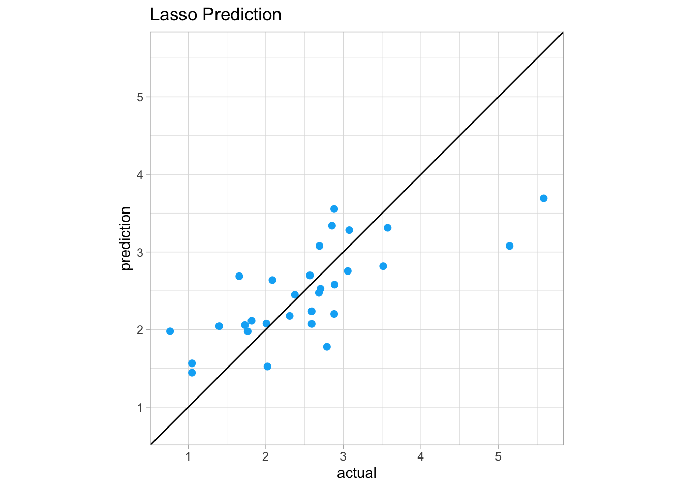
We can see in regions of the plot above the y = x line that the model overpredicted the actual values. If a point is below the y = x line, the model underpredicted the values.
Ridge Prediction
We can then perform the same functions using the generalized linear model with the Ridge penalty to test on the testing data.
s0 <- cvglmnet_ridge$lambda.1se

ridge_predict <- predict(cvglmnet_ridge, newx = predictors_test, s = s0)

# create a data frame of the predicted values and actual values
actual_ridge_predict_df <- data.frame(prediction = as.vector(ridge_predict), actual = prostate_test$lpsa)
We can then see how correlated the prediction and real data are using the cor function again.
cor(actual_ridge_predict_df)## prediction actual
## prediction 1.0000000 0.7765403
## actual 0.7765403 1.0000000The Ridge prediction and actual values are 77% correlated.
Finally, we can plot the actual vs. predicted values on a scatter plot. If the actual and predicted values matched up exactly, they would sit on the y = x line.
ggplot(actual_ridge_predict_df, aes(x = actual, y = prediction)) +
  geom_point(color = "#FF62BC", size = 2) +
  geom_abline(slope=1, intercept=0) +
  ggtitle("Ridge Prediction") +
  theme_light() +
  coord_fixed(xlim = c(0.75, 5.6),
              ylim = c(0.75, 5.6))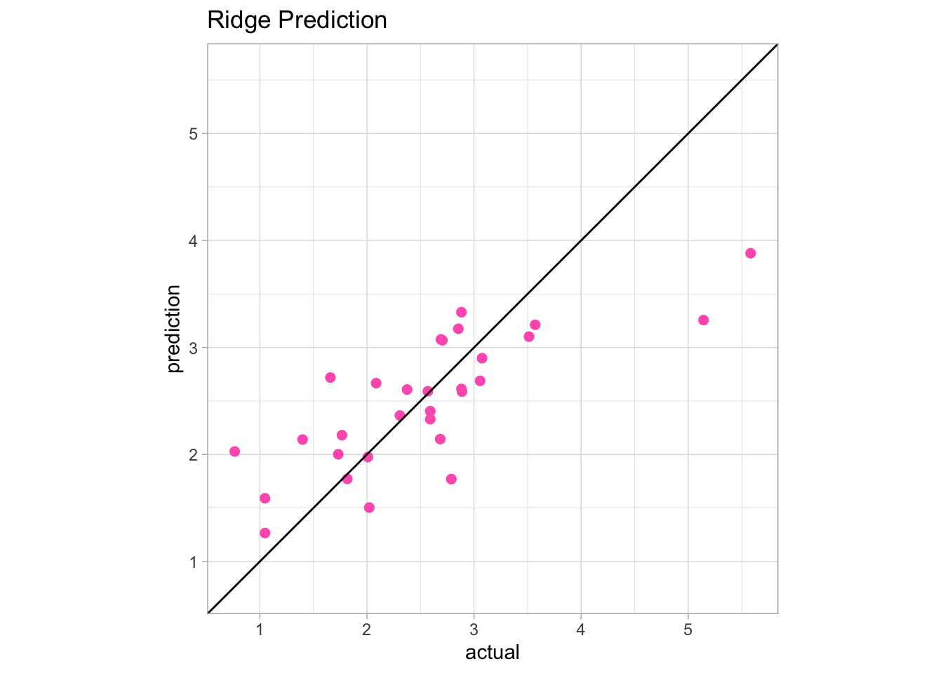
We can see in regions of the plot above the y = x line that the model overpredicted the actual values. If a point is below the y = x line, the model underpredicted the values.
Conclusion
Comparing the Lasso and Ridge penalty, based on the cross-validation, the Ridge penalty had a smaller 1se Measure, showing that it performs better. When looking at the actual predictions on the testing data, the Ridge penalty had a higher correlation between the predicted and actual values (77%) compared to the Lasso penalty correlation (72%). In conclusion, the Ridge penalty performed better on this particular data set.
Resources - https://stats.stackexchange.com/questions/68431/interpretting-lasso-variable-trace-plots