Exercise Solution for 5.1
This exercise asks us to interpret and validate the consistency within our clusters of data. To do this, we will employ the silhouette index, which gives us a silhouette value measuring how similar an object is to its own cluster compared to other clusters.
The silhouette index is as follows:
\[\displaystyle S(i) = \frac{B(i) - A(i)}{max_i(A(i), B(i))} \]
The book explains the equation by first defining that the average dissimilarity of a point \(x_i\) to a cluster \(C_k\) is the average of the distances from \(x_i\) to all of the points in \(C_k\). From this, let \(A(i)\) be the average dissimlarity of all points in the cluster that \(x_i\) belongs to, and \(B(i)\) is the lowest average of dissimlarity of \(x_i\) to any other cluster of which \(x_i\) is NOT a member.Basically, we are subtracting the mean distance to other instances in the same cluster from the mean distance to the instances of the next closest cluster, and dividing it by which of the two values is larger. The output is a coefficient that will vary between -1 and 1, where a value closer to 1 implies that the instance is closest to the correct cluster.
The solution to this exercise requires the following R packages to be loaded into your environment.
Required Libraries
library(cluster)
library(dplyr)
library(ggplot2)
library(purrr)
Part A
Question 5.1.a asks us to compute the silhouette index for the simdat data that was simulated in Section 5.7.
The provided code is used to simulate data coming from four separate groups. They use the pipe operator to concatenate four different, randomly generated, data sets. The ggplot2 package is used to take a look at the data as a barchart of the within-groups sum of squared distances (WSS) obtained from the k means method.
First off, we need to set the seed to ensure reproducible results with a randomly generated data set.
set.seed(1)The following chunk of code utilizes the lapply function two times to generate a datset with four distinct clusters. The lapply function comes from base R, and is most often used to apply a function over an entire list or vector.
set.seed(1)


simdat = lapply(c(0, 8), function(mx) {
  lapply(c(0,8), function(my) {

    tibble(x = rnorm(100, mean = mx, sd = 2),
           y = rnorm(100, mean = my, sd = 2),
           class = paste(mx, my, sep = ":"))
   }) %>% bind_rows
}) %>% bind_rows

simdatxy = simdat[, c("x", "y")] # data without class label
The technique the authors used to generate a clustered dataset is tricky. The lapply within an lapply, paired with two bind_rows functions can be confusing. The next sections are included to demonstrate what the data looks like through various steps in this process, and help bring understanding to the reader how the code is working.
The inner lapply function
The first lapply is generating a vector of n = 100 normally distributed random numbers, and creating two separate dataframes packed into a list that consist of the mean (my) and standard deviation, respectively. Each individual value is specifically assigned a 0 or an 8.
simdatmy = lapply(c(0,8), function(my) {

    tibble(y = rnorm(100, mean = my, sd = 2),
           class = paste(my, sep = ":"))
   })
summary(simdatmy)
## Length Class Mode
## [1,] 2 tbl_df list
## [2,] 2 tbl_df listThe outer lapply function
The second (outer) lapply uses the same idea to apply the same, random, 0 or 8 assignment to values in the mx function. The ouput is now four separate dataframes within a list that contain all of the mx data and all of the my data. Within the tibble function, they include the code class = to ensure that each row in each of the 4 the lists is assigned one of the four possible two-way combinations of 0 and 8. This is important to simulate a clustered dataset.
simdatmx = lapply(c(0, 8), function(mx) {
  lapply(c(0,8), function(my) {

    tibble(x = rnorm(100, mean = mx, sd = 2),
           y = rnorm(100, mean = my, sd = 2),
           class = paste(mx, my, sep = ":"))
    })})
summary(simdatmx)
## Length Class Mode
## [1,] 2 -none- list
## [2,] 2 -none- listPutting it together
The last step is to bind the list of dataframes into one single dataframe. The final dataframe includes all of the x and y data, each with assigned classes, defined by a combination of 0 and 8.
set.seed(1)


simdat = lapply(c(0, 8), function(mx) {
  lapply(c(0,8), function(my) {

    tibble(x = rnorm(100, mean = mx, sd = 2),
           y = rnorm(100, mean = my, sd = 2),
           class = paste(mx, my, sep = ":"))
   }) %>% bind_rows
}) %>% bind_rows

head(simdat)
## # A tibble: 6 x 3
## x y class
## <dbl> <dbl> <chr>
## 1 -1.25 -1.24 0:0
## 2 0.367 0.0842 0:0
## 3 -1.67 -1.82 0:0
## 4 3.19 0.316 0:0
## 5 0.659 -1.31 0:0
## 6 -1.64 3.53 0:0unique(simdat$class)## [1] "0:0" "0:8" "8:0" "8:8"The final simdat dataframe includes 400 random points witih an assigned class to simulate clustering. We can look at the data using a simple ggplot scatterplot, color coded by the class of each point.
ggplot(simdat, aes(x = x, y = y, color = class)) + geom_point()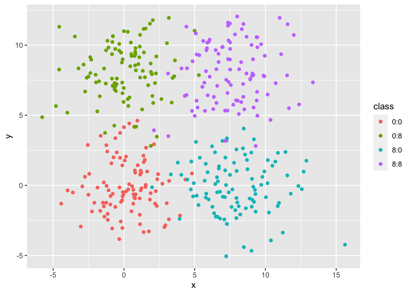
The next part of exploring the data is to compute the within-groups sum of squares (WSS) for the clusters that we just generated. The goal of this section is to observe how the WSS changes as the number of clusters is increased from 1 to 8 when using the k-means. Chapter 5 provides us with the following code and graph:
#1
wss = tibble(k = 1:8, value = NA_real_)

#2
wss$value[1] = sum(scale(simdatxy, scale = FALSE)^2)

#3
for (i in 2:nrow(wss)) {
  km  = kmeans(simdatxy, centers = wss$k[i])
  wss$value[i] = sum(km$withinss)
}

ggplot(wss, aes(x = k, y = value)) + geom_col()
What is really going on here?
This first chunk is setting up a one-column dataframe with blank NA values. The NAs will be filled in with values as the rest of the code processes.
#1
wss = tibble(k = 1:8, value = NA_real_)
wss
## # A tibble: 8 x 2
## k value
## <int> <dbl>
## 1 1 NA
## 2 2 NA
## 3 3 NA
## 4 4 NA
## 5 5 NA
## 6 6 NA
## 7 7 NA
## 8 8 NAThe second chunk of code is calculating the value for k = 1 individually. They use the scale function to scale down the value for k = 1 because it is so much larger than the rest of the k-values. Without scaling down the k = 1 value, it would be difficult to observe any sharp decreases that might indicate a “potential sweet spot” for the number of clusters.
#2
wss$value[1] = sum(scale(simdatxy, scale = FALSE)^2)
wss
## # A tibble: 8 x 2
## k value
## <int> <dbl>
## 1 1 15781.
## 2 2 NA
## 3 3 NA
## 4 4 NA
## 5 5 NA
## 6 6 NA
## 7 7 NA
## 8 8 NAThe last part of this chunk is running a k-means clustering on the remaining k 2 through 8 and then pulling out the withinss value for all of the observations, summing it, and assigning that value to each individual k-value.
#3
for (i in 2:nrow(wss)) {
  km  = kmeans(simdatxy, centers = wss$k[i])
  wss$value[i] = sum(km$withinss)
}

km$withinss
## [1] 275.2533 165.2368 199.8292 257.9090 285.8292 131.9047 239.8457 339.1308wss## # A tibble: 8 x 2
## k value
## <int> <dbl>
## 1 1 15781.
## 2 2 9055.
## 3 3 5683.
## 4 4 3088.
## 5 5 2755.
## 6 6 2441.
## 7 7 2152.
## 8 8 1895.These corresponding values are then neatly displayed in a barchart of the WSS stastistic as a function of k. The sharp decrease between k = 3 and k = 4 (at the elbow) is indicative of the number of clusters present in the dataset.
ggplot(wss, aes(x = k, y = value)) + geom_col()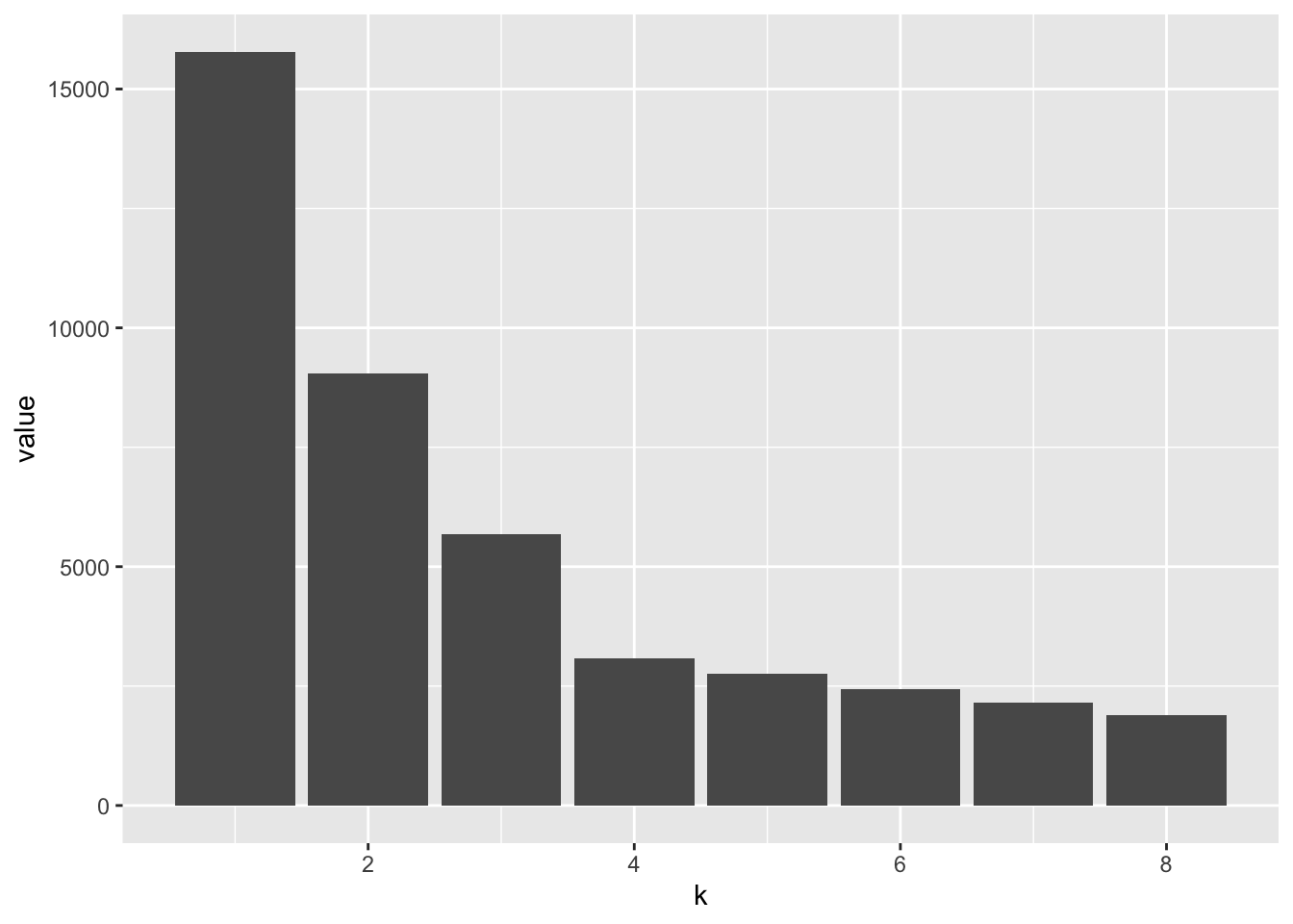
Computing the silhouette index for simdat
Next up is the code necessary to plot the silhouette index. The silhouette function comes from the cluster package, and the resulting graph provides an average silhouette width for k = 4 clusters.
pam4 = pam(simdatxy, 4)
sil = silhouette(pam4, 4, border = NA)
The pam (partitioning around medoids) function is doing the same thing as the kmeans call from the earlier chunk of code, but using the cluster package’s algorithm to calculate the k-means clustering. We use the pam function here because the we need the “pam” and “partition” output class to run the silhouette function. With this information, we can then compute the silhouette index and view the output summary and plot.
class(pam4)## [1] "pam" "partition"sil = silhouette(pam4, 4, border = NA)
summary(sil)## Silhouette of 400 units in 4 clusters from pam(x = simdatxy, k = 4) :
## Cluster sizes and average silhouette widths:
## 103 100 99 98
## 0.5279715 0.5047895 0.4815427 0.4785642
## Individual silhouette widths:
## Min. 1st Qu. Median Mean 3rd Qu. Max.
## -0.04754 0.41232 0.54916 0.49858 0.63554 0.71440Before we explore the final output plot, it might be interesting to look at plots of the simulated values with their respective cluster assignments based on pam k-means clustering and the silhouette index. With some (a lot of) help from Brooke, we have the following code to view this.
For the most part, all of the points were assigned to the same cluster as the original, with the occational border point mis-assigned to the neighboring cluster. Interestingly, the silhouette index approaches zero when you near the border of of the cluster and is much higher near the center of the cluster. Although we would expect this, it can be helpful to view this graphically.
sil %>%
  unclass() %>%
  as.data.frame() %>%
  tibble::rownames_to_column(var = "orig_order") %>%
  arrange(as.numeric(orig_order)) %>%
  bind_cols(simdat) %>%
  ggplot(aes(x = x, y = y, shape = as.factor(cluster), color = sil_width)) +
  geom_point() +
  facet_wrap(~ class)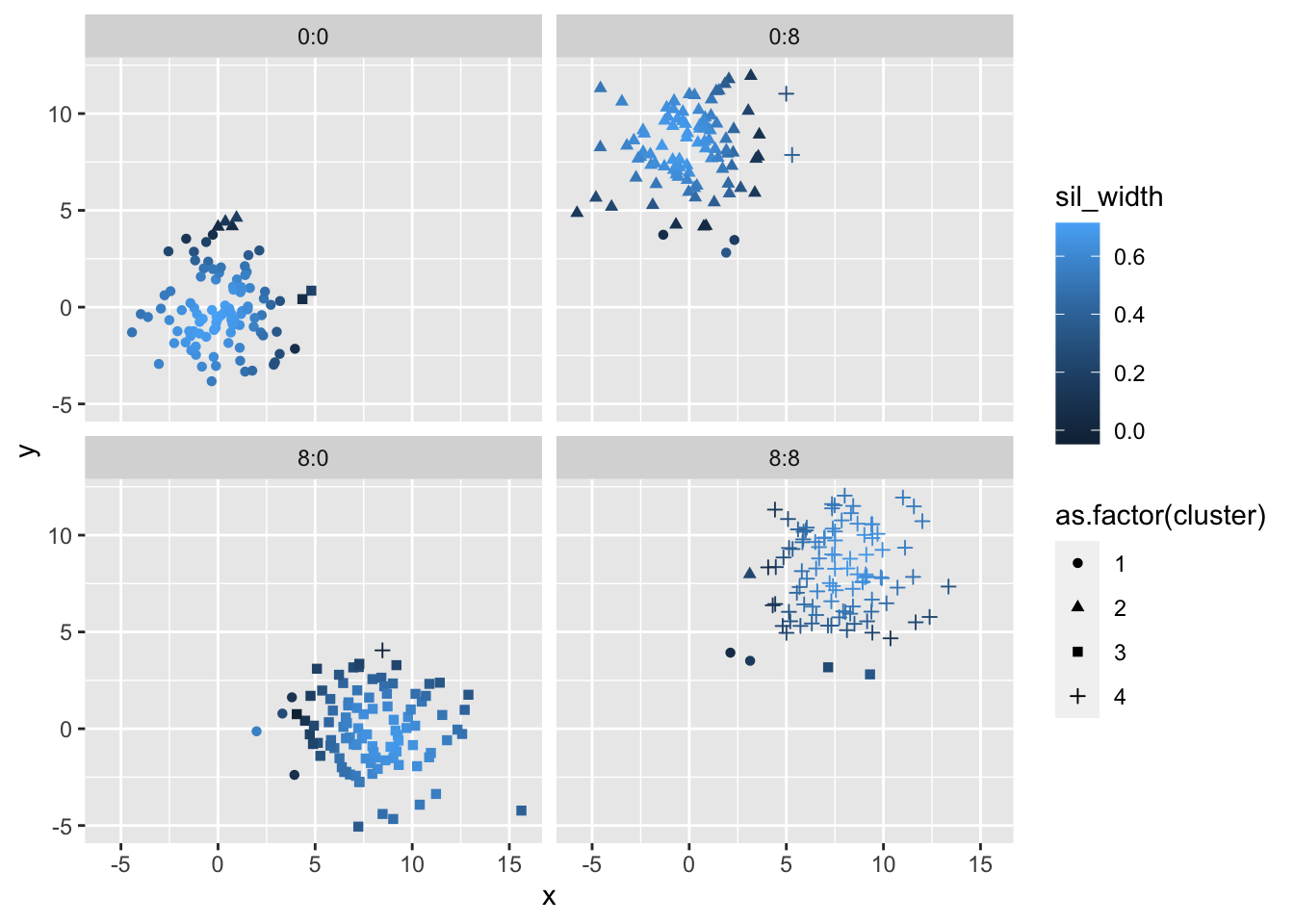
And finally, a silhouette plot with the n = 400 data points. The average silhouette width is a metric that we can use to summarize everything at a level of the full clustering process. Essentially, the closer that this average is to 0.5, then the more accurate our number of clusters k is. This concept is further explored in the Part B.
plot(sil, col=c("red","green","blue","purple"), main="Silhouette", border = "NA")
Part B
Question 5.1.b asks us to change the number of clusters k and assess which k value produces the best silhouette index.
In this example, there are a couple of ways to assess which k gives the best silhouette index.One method would be trial and error and determining which k-value produces the highest silhouette index. This method works out for this example, but is impractical for much larger and complex datasets. Included below is the code for testing multiple different k-values and the resulting coefficient values.
pam2 = pam(simdatxy, 2)
sil2 = silhouette(pam2, 2)
plot(sil2, col=c("red","green","blue","purple"), main="Silhouette", border = "NA")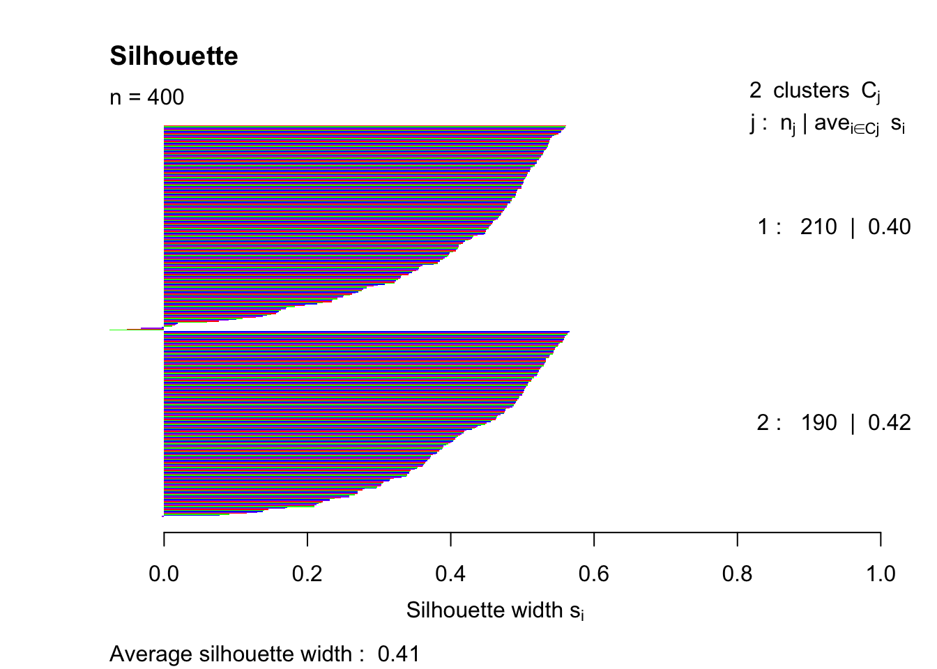
pam3 = pam(simdatxy, 3)
sil3 = silhouette(pam3, 3)
plot(sil3, col=c("red","green","blue","purple"), main="Silhouette", border = "NA")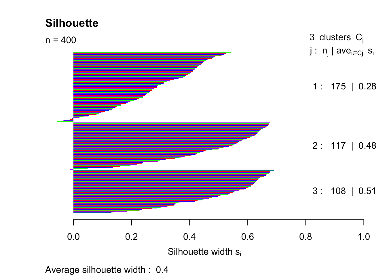
pam4 = pam(simdatxy, 4)
sil = silhouette(pam4, 4)
plot(sil, col=c("red","green","blue","purple"), main="Silhouette", border = "NA")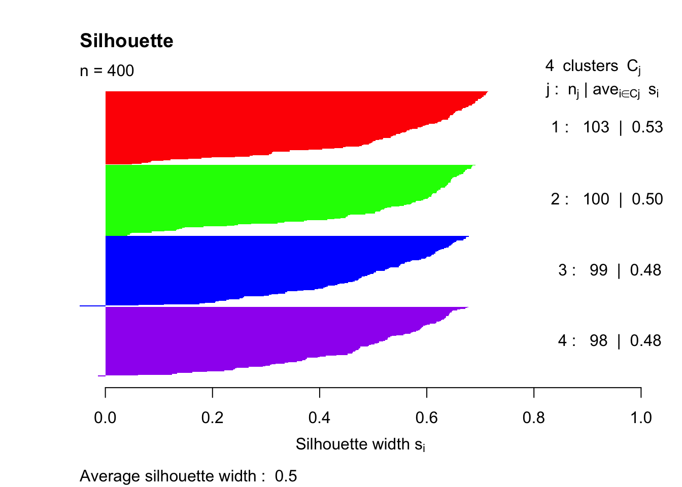
pam12 = pam(simdatxy, 12)
sil12 = silhouette(pam12, 12)
plot(sil12, col=c("red","green","blue","purple"), main="Silhouette", border = "NA")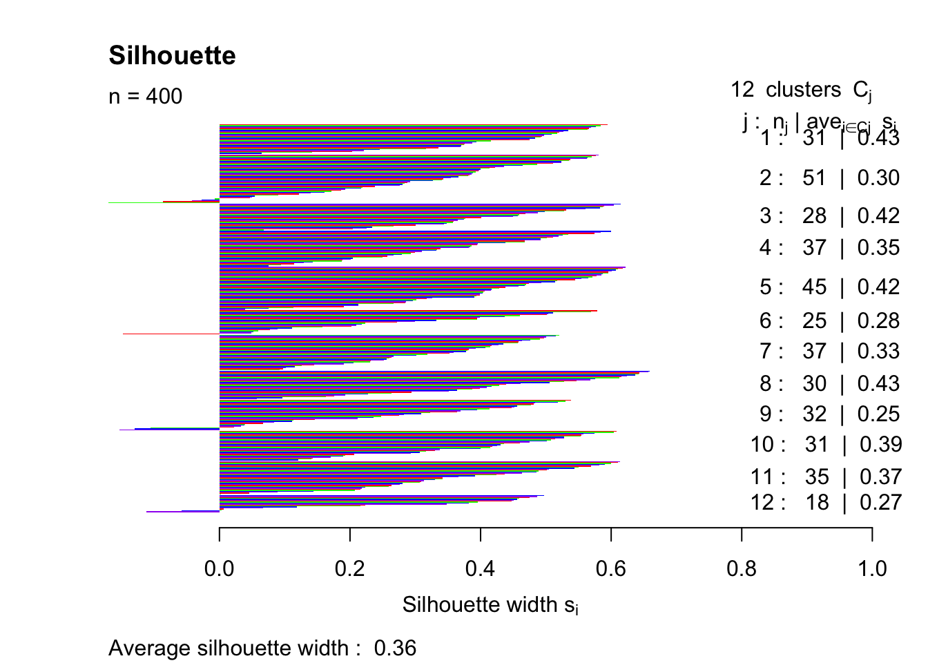
pam40 = pam(simdatxy, 40)
sil40 = silhouette(pam40, 40)
plot(sil40, col=c("red","green","blue","purple"), main="Silhouette", border = "NA")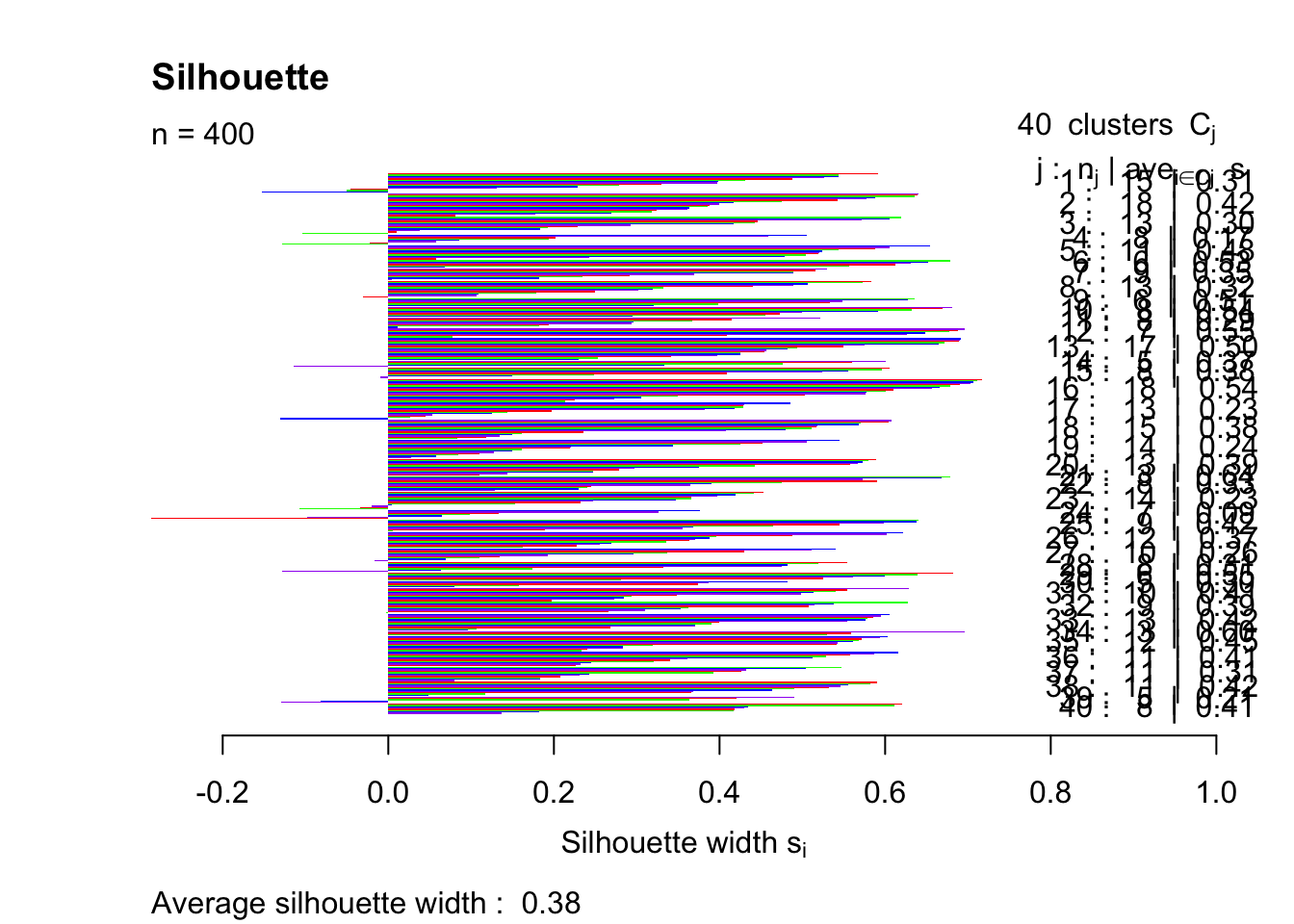
This trial and error method indicates that the highest silhouette index (that was tested) is achieved with k = 4.
A different (seemingly more appropriate) method is to write a piece of code that will test a range of k-values automatically. This next piece of code is adapted from Amy Fox and the group that she worked with during class. This is a much more practical method that provides a clear answer of which k gives the best silhouette index.
k <- c(2:10)
df_test <- data.frame()
for (i in 2:10){

  pam_run <- pam(simdatxy, i)
  sil_run <- silhouette(pam_run, i)

  row_to_add <- data.frame(i, width = summary(sil_run)$avg.width)

  df_test <- rbind(df_test, row_to_add)
}
df_test
## i width
## 1 2 0.4067400
## 2 3 0.4000560
## 3 4 0.4985801
## 4 5 0.4401518
## 5 6 0.3957347
## 6 7 0.3717875
## 7 8 0.3699929
## 8 9 0.3670770
## 9 10 0.3516570ggplot(df_test, aes(i, width)) +
geom_point() +
geom_line() +
xlab("k") +
ylab("Silhouette Index") +
ggtitle("Testing different k values for Silhouette Index")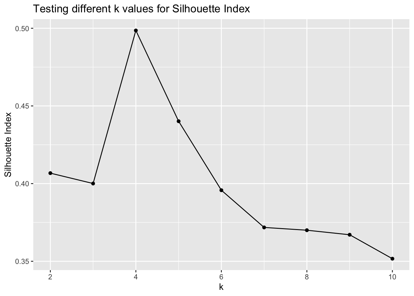
summary(sil_run)## Silhouette of 400 units in 10 clusters from pam(x = simdatxy, k = i) :
## Cluster sizes and average silhouette widths:
## 63 38 40 52 33 40 35 33
## 0.3885059 0.3273800 0.3622990 0.3703291 0.3573781 0.3257945 0.4429236 0.2807700
## 31 35
## 0.3944945 0.2335738
## Individual silhouette widths:
## Min. 1st Qu. Median Mean 3rd Qu. Max.
## -0.1778 0.2389 0.3703 0.3517 0.4946 0.6623The result of summary(sil_run) matches the trial and error method, but in a more efficient manner.
In summary, k = 4 provides us with the best silhouette index value. This is because there truly are four groups in the dataset based on how we created it.
Part C
The last part of this exercise asks us to repeat by calculating the silhouette index on a uniform (unclustered) data distribution over a range of values.
Here, a new data set is generated without clustering the randomly generated data. The 0 and 8 assignment values have been removed and replaced with a singular 1. This assigns all of the values to have the same class.
set.seed(1)

simdat1 = lapply(c(1), function(mx) {
  lapply(c(1), function(my) {
    tibble(x = rnorm(100, mean = mx, sd = 2),
           y = rnorm(100, mean = my, sd = 2),
           class = paste(mx, my, sep = ":"))
   }) %>% bind_rows
}) %>% bind_rows

simdatxy1 = simdat1[, c("x", "y")]

ggplot(simdatxy1, aes(x = x, y = y)) +
  geom_point()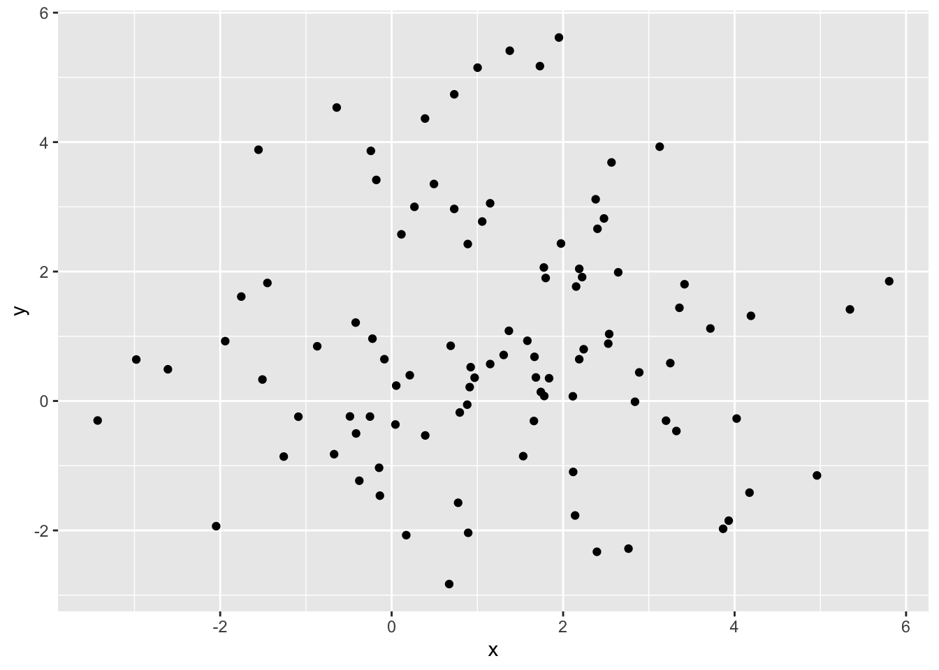
pam4.1 = pam(simdatxy1, 4)
sil.1 = silhouette(pam4.1, 4)
plot(sil.1, col=c("red","green","blue","purple"), main="Silhouette", border = "NA")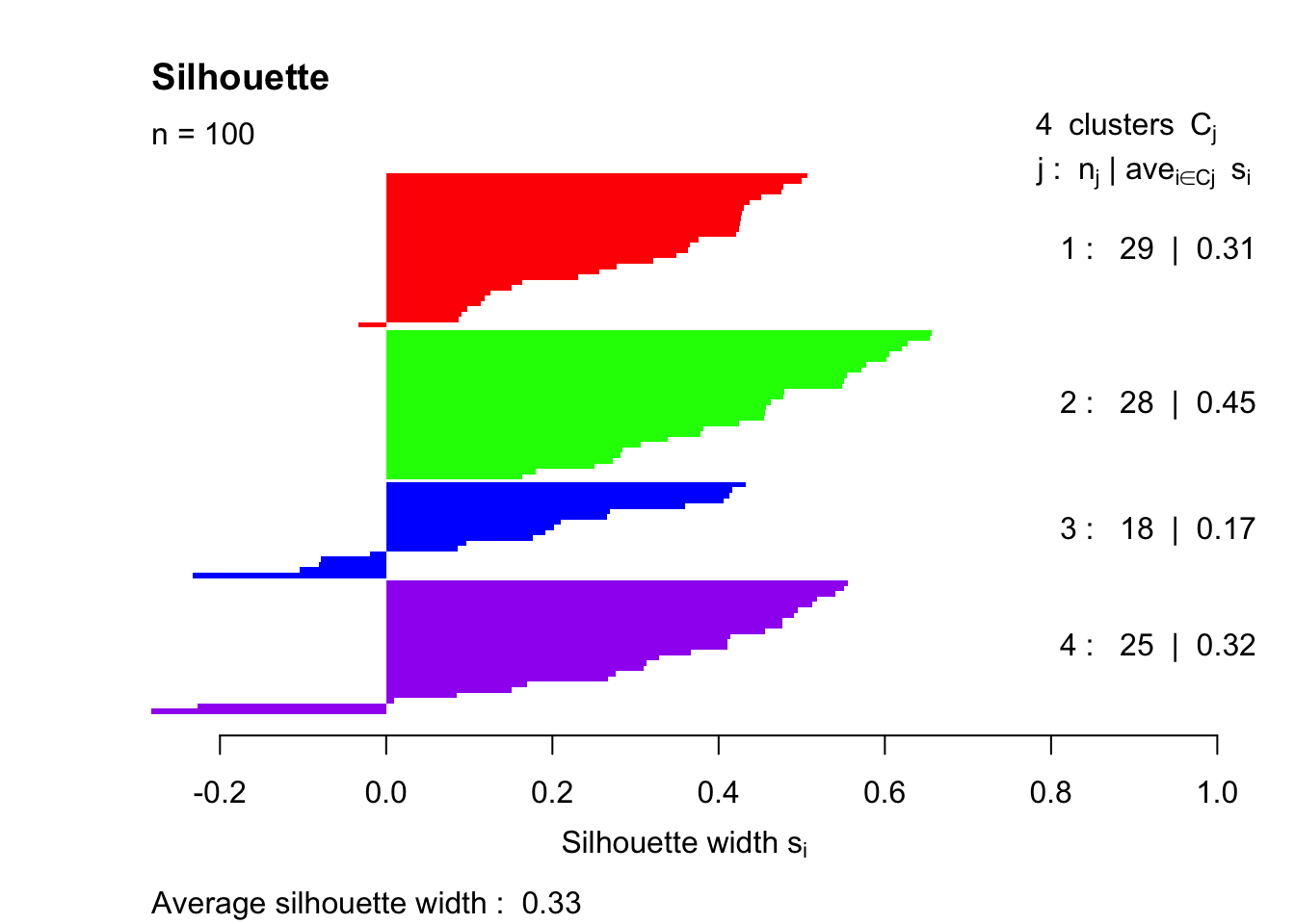
The average silhouette width is 0.33, which is much lower than the clustered value of 0.50 that we see with the first simulation. It should be pointed out that several of the points end up with negative silhouette widths. These observations were assigned to the wrong group entirely.
Resources
Modern Statistics for Modern Biology - Chapter 5